AWS Unveils Enhanced Custom Event Bus in Amazon EventBridge to Eliminate Multi-Account Complexity and Scale Serverless Architectures

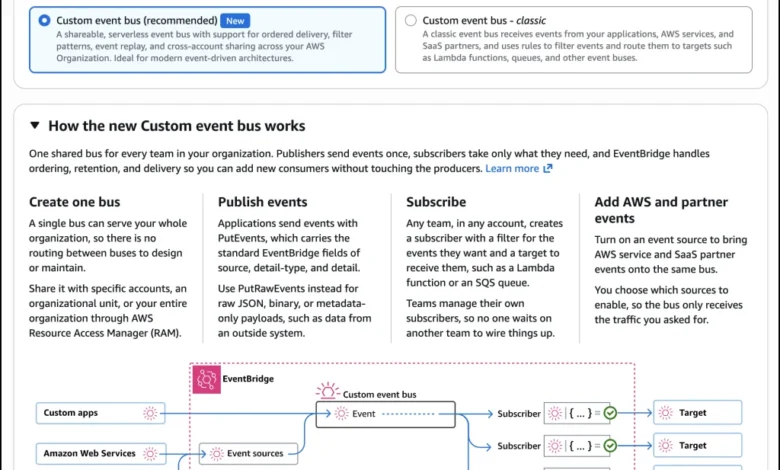
Amazon Web Services (AWS) has officially announced the launch of an enhanced custom event bus for Amazon EventBridge, designed to address the operational friction that organizations frequently encounter when scaling event-driven applications across multiple AWS accounts. Historically, as serverless adoption expanded within enterprises, the standard practice of deploying isolated custom event buses per account created a complex web of cross-account rules and bus-to-bus configurations. This architectural workaround inadvertently reintroduced the very operational overhead that serverless computing was intended to eliminate.
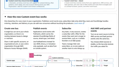
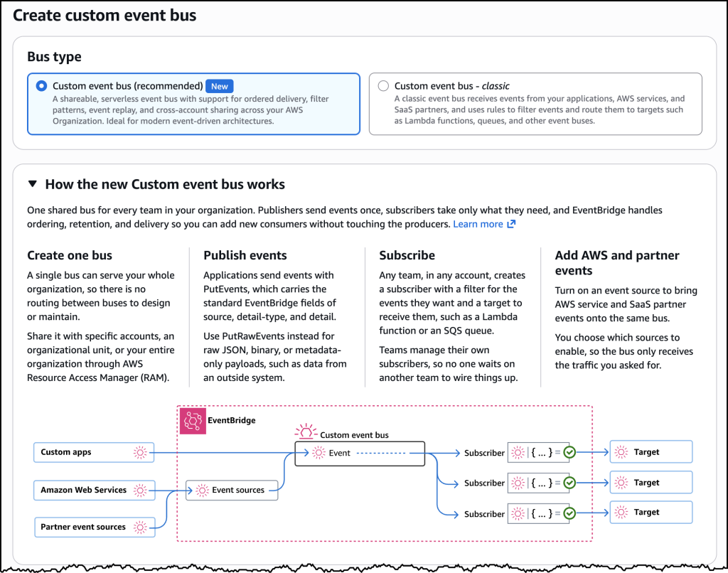
The newly introduced enhanced custom event bus allows organizations to deploy a single, centralized event bus shared across all AWS accounts within an enterprise structure. By combining native ordering guarantees, a streamlined Subscriber resource, and a throughput-based pricing model, AWS aims to provide organizations with improved economic efficiency at scale while restoring granular visibility and governance for platform engineering teams.
The Evolution of Event-Driven Architectures and Multi-Account Challenges
In the early stages of adopting event-driven architectures, development teams typically deploy a single custom event bus within an isolated AWS account. This streamlined configuration functions efficiently under a single-team ownership model. However, as enterprise adoption matures, adherence to AWS security and governance best practices dictates a multi-account strategy. Under this paradigm, individual business units and product teams operate within dedicated AWS environments to maintain isolation, security boundaries, and autonomous deployment cadences.
To facilitate communication between these disparate accounts, engineering teams historically relied on intricate cross-account permissions and interconnected bus topologies. This decentralized approach presented significant operational challenges. Platform teams experienced a notable loss of visibility regarding event subscriptions and data flows across the organization. Furthermore, compound routing charges associated with multi-bus configurations escalated operational expenditures rapidly.

Compounding these architectural hurdles, applications requiring strict event sequencing—such as financial transaction processing or real-time logistics tracking—were forced to implement complex application-level workarounds or integrate external queuing services to preserve message order. The new enhanced custom event bus directly targets these friction points by unifying cross-account event routing into a managed, highly scalable foundational layer.
Architectural Capabilities of the Enhanced Custom Event Bus
The newly launched capability introduces several critical architectural enhancements designed to streamline publishing, filtering, and delivery mechanics within complex enterprise environments.
Organization-Wide Sharing via AWS RAM
At the core of the enhanced event bus is native resource sharing powered by AWS Resource Access Manager (AWS RAM). Platform administrators can provision a single central event bus and configure sharing policies that span entire AWS organizations, specific organizational units (OUs), or individual AWS accounts and IAM principals.
This native integration eliminates the manual overhead of establishing cross-account resource policies and bus-to-bus routing rules. Publishers can emit events to the central backbone without needing to identify or maintain knowledge of downstream consumers. Concurrently, application teams can independently establish their own subscriptions, significantly reducing time-to-market for new microservices. To prevent resource fragmentation, the enhanced bus supports a default quota of 10,000 subscribers per bus, with provisions to request higher limits based on organizational scale.
Native Event Ordering and Synchronous Delivery
While asynchronous messaging paradigms form the bedrock of resilient event-driven systems, certain business domains require strict sequential processing. For instance, in supply chain management and fleet tracking applications, telemetry updates concerning driver locations must be processed in exact chronological order to prevent algorithmic errors caused by stale data ingestion.

The enhanced custom event bus accommodates both asynchronous processing and ordered delivery on the same infrastructure. Publishers can attach an EventGroupId parameter to payloads. EventBridge subsequently routes events sharing identical identifiers in strict sequence to subscribers configured for ordered delivery, while simultaneously serving unordered consumers from the same event stream.
To guarantee reliable ordered processing, AWS has introduced synchronous invocation support for targets such as AWS Lambda. This operational mode confirms successful downstream execution before acknowledging event receipt, effectively removing the historical requirement to provision Amazon Simple Queue Service (Amazon SQS) queues between the event bus and compute layers solely for sequencing and reliability.
The Unified Subscriber Resource
Streamlining configuration management, the enhanced event bus introduces the Subscriber resource. This construct consolidates event filtering, target definition, retry parameters, and dead-letter queue destinations into a single manageable entity. Previously, achieving equivalent functionality necessitated the orchestration of disparate rules, targets, and individual retry policies across multiple AWS resources. Furthermore, the inclusion of variable start time options simplifies consumer onboarding and facilitates event replay scenarios for disaster recovery or application rehydration.
Advanced Event Evaluation and Transformation
To address data quality and schema discrepancies, the architecture incorporates advanced evaluation mechanics:
- Content-Based Deduplication: EventBridge can automatically evaluate event payloads to detect and suppress duplicate retries occurring within a five-minute window, conferring exactly-once delivery semantics for event sources incapable of generating native idempotency tokens.
- JSONata Transformations: Downstream consumers can utilize JSONata expressions to reshape, filter, or compute values within payloads before delivery, enabling seamless integration with APIs that require specific data schemas.
- Deserialization Support: For organizations utilizing serialization formats such as Apache Avro or Protocol Buffers, EventBridge can natively deserialize payloads into JSON. This allows subscribers to execute fine-grained filtering across the entire event payload without requiring bespoke parsing logic in the consumer application.
Economic Restructuring Through Throughput-Based Pricing
To align costs with actual resource utilization, AWS has established a new pricing model for the enhanced custom event bus. Shifting away from legacy per-event pricing schemes that accumulated compound charges across multi-bus topologies, the new model separates costs into ingress and egress throughput components. Publishers incur charges based on the volume of events ingested, while subscribers pay for data delivered. This transparent structure aims to provide predictable cost allocation and enhanced cost-efficiency for large-scale enterprise deployments.
Availability and Transition Strategy
The enhanced custom event bus is available immediately across a broad footprint of global AWS Regions, including US East (N. Virginia, Ohio), US West (Oregon), Europe (Ireland, Frankfurt, Stockholm, Spain), and Asia Pacific (Hong Kong, Malaysia, Mumbai, Singapore, Sydney, Thailand, Tokyo). Organizations can provision the new resource utilizing the AWS Management Console, AWS Command Line Interface (AWS CLI), or programmatic EventBridge APIs.
AWS has confirmed that existing custom event buses will remain fully supported, operating continuously without disruption under the newly designated classification of "Custom event bus – classic." Organizations are not subjected to mandatory migration timelines, allowing platform engineering teams to adopt the enhanced custom event bus incrementally at a pace suited to their internal release cycles and architectural roadmaps.
Related posts: