Beyond the Spreadsheet: Transforming Data Visualization Through UX Design Principles

In the modern enterprise, data has transitioned from a scarce commodity to an overwhelming surplus. Organizations across every sector—from finance and healthcare to retail and technology—now possess more telemetry, user activity logs, and performance metrics than ever before. Yet, a recurring paradox persists: despite the ubiquity of high-powered business intelligence (BI) tools, critical meetings frequently conclude without a clear path forward. While the data itself is often technically accurate, the communication of that data remains inert. The failure is rarely in the mathematics or the raw inputs, but rather in the architecture of the interface. Bridging the gap between raw data and actionable insight requires moving beyond simple chart generation and adopting a user-experience (UX) framework that prioritizes human decision-making.
The Intersection of Design and Analytics
Data visualization and UX design share a singular objective: the seamless transfer of information to a user in a manner that facilitates an outcome. In traditional corporate settings, dashboards are often constructed by connecting a data source to a visualization tool without prior interrogation of the end-user’s needs. This “data-first” approach assumes that the visibility of a number equates to the utility of that number. Conversely, a UX-driven approach treats a dashboard as a product. It requires the designer to understand the user’s cognitive load, their accountability within the organization, and the specific decisions they are empowered to make.

Historically, the industry has leaned on the principle of the “data-ink ratio,” championed by statistician Edward Tufte, which posits that every mark on a graphic must convey data. While essential for reducing clutter, this principle can be insufficient when applied in isolation. A minimalist chart may be aesthetically perfect but functionally empty if it strips away the context required for a stakeholder to assess risk or opportunity. The goal, therefore, is not simplicity for its own sake, but "appropriate complexity"—the calibration of information density to match the user’s specific operational requirements.
The 80% Rule: Pre-Visualization Strategy
In professional data design, approximately 80% of the project’s success is determined before a single graph is rendered. This preparatory phase involves answering three foundational questions that define the lifecycle of the data project: What is the specific goal? Who is the audience? And what is the intended behavioral change?
Industry research indicates that when stakeholders are asked to define a goal for a dashboard, they often provide vague objectives, such as "tracking product performance." However, precision is the difference between a static report and a functional tool. A refined goal—such as "identifying specific feature bottlenecks causing retention drop-offs among Q1 cohorts"—transforms the design process. It dictates which variables must be included and, more importantly, which should be discarded as noise.

The audience factor involves two key variables: literacy and accountability. A senior executive requires a highly synthesized, high-level summary that facilitates rapid capital or strategy allocation. In contrast, an analyst or product manager requires a dense, multi-layered environment to perform root-cause analysis. When dashboards fail to differentiate between these personas, they create friction: the executive is overwhelmed by unnecessary detail, while the analyst finds the information too aggregated to be actionable.
Historical Context: From Anscombe to Modern Dashboards
The necessity of thoughtful visualization was arguably formalized in 1973 by statistician Francis Anscombe. His construction of the "Anscombe’s Quartet"—four datasets that share identical statistical properties (mean, variance, and correlation) but produce vastly different visual patterns—serves as the cornerstone of modern data literacy. It demonstrated that raw summary statistics can hide the operational truth.
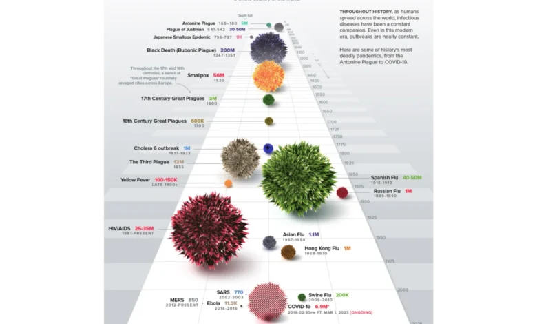
In the decades since, the evolution of data visualization has moved from simple descriptive reporting to complex interactive storytelling. Tools like Visual Capitalist’s mapping of historical pandemics highlight this shift. By utilizing proportional bubble layouts on a timeline, these visualizations allow the human brain to process the scale of mass casualty events instantly, long before the reader processes the specific numeric labels. This is the hallmark of effective design: it leverages human cognitive patterns to make the story "impossible to miss."

The Impact of Insight-Driven Design: A Case Study
The transition from passive reporting to active insight is best illustrated through the lens of organizational outcomes. In recent internal audits of enterprise SaaS platforms, projects that moved away from "catch-all" dashboards to goal-oriented, user-specific interfaces saw a marked increase in user engagement.
Consider an organization facing a sudden drop in booking rates. A standard dashboard might highlight the 15% decline, triggering a reactive "fire drill" where departments scramble to address a perceived flaw in the user interface. However, a dashboard designed for insight would map the drop against external variables, such as marketing campaign traffic. By overlaying the data, the team might discover that the drop was not due to a technical failure, but rather an influx of low-intent traffic from an underperforming ad campaign. The insight is immediate: stop the campaign rather than redesigning the app. This shift in perspective prevents the misallocation of engineering resources and saves significant operational costs.
Building for the Future: Practical Implementation
To implement these strategies, project teams must adopt a rigorous workflow:

- Define the Operational Question: Before opening a BI tool, clearly articulate the decision the data must support.
- Determine the Density Dial: Adjust the amount of data presented based on whether the user is an analyst performing deep discovery or an executive making a time-sensitive decision.
- Establish a Shared Mental Model: Use consistent color-coding and iconography across all platforms to reduce the learning curve. If a product line is assigned a specific color in branding, that color must be embedded into the data model from the start.
- Prioritize Proactive Over Reactive: Design interfaces that allow users to identify trends before they become crises. This shifts the organizational culture from "post-mortem" reporting to real-time, proactive management.
The use of specific chart types, such as radar charts for multi-dimensional competency tracking, exemplifies this approach. By mapping eight or more variables across polar axes, the user can identify a balanced profile versus a skewed one at a single glance. This is more efficient than scanning eight individual bar charts, as it creates a holistic "shape" that the human eye can interpret intuitively.
Implications for Corporate Strategy
The implications for businesses that adopt a UX-first approach to data are significant. Organizations that successfully transition from static, passive dashboards to dynamic, actionable interfaces often report improved employee satisfaction, as staff feel empowered by the clarity of their tools. Furthermore, the reduction in time spent on data-processing meetings allows leadership to reallocate hours toward strategy and execution.
Market analysts note that the next wave of business intelligence will not be defined by which companies have the most data, but by which companies can extract the most utility from that data. As AI and machine learning continue to automate data gathering, the human element—the ability to design for the decision-maker—becomes the true competitive advantage.

Conclusion
The divide between data and design is closing. As organizations recognize that data visualization is a form of communication rather than just a technical output, the role of the data analyst is increasingly merging with that of the designer. By treating dashboards as products that require consistent iteration, user research, and clear intent, enterprises can transform their data from a passive log of historical performance into a strategic asset that drives the direction of the future. The metrics are only as valuable as the decisions they provoke, and in a competitive, fast-paced economy, clarity is the ultimate currency.