The Comprehensive Guide to Naming UI Components and Design Systems for Scalable Digital Products

The fundamental challenge of naming within digital product development is a persistent issue that impacts operational efficiency, cross-departmental communication, and end-user comprehension. Language serves as the primary architecture for how teams conceptualize interfaces; when terminology becomes fragmented, the resulting friction manifests in design inconsistencies, technical debt, and poor feature adoption. In the complex ecosystem of modern software engineering, where developers, designers, and product managers must align on a singular vocabulary, the ambiguity surrounding UI components, design tokens, and variables often creates a "Tower of Babel" effect. This article examines the systemic challenges of naming, explores industry-standard resources, and outlines frameworks for establishing a scalable nomenclature.

The Anatomy of Naming Disconnects
At the core of the issue is the tension between being too generic versus too specific. A name that is overly broad—such as "box" or "item"—fails to convey functional intent, leading to ambiguity in documentation and code. Conversely, hyper-specific naming, such as "blue-submit-button-large," restricts the reusability of the component, forcing developers to create redundant assets when requirements shift.
Research suggests that teams spending time on upfront taxonomy alignment see a 30% reduction in "rework" hours during the design-to-development handoff phase. When nomenclature is inconsistent, designers often create duplicates in their libraries, while developers struggle to map CSS classes to specific UI intent. This lack of a shared "source of truth" results in what industry experts describe as "dialect drift," where different departments essentially speak different languages regarding the same product features.

Establishing a Foundational Taxonomy
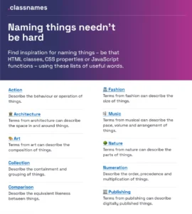
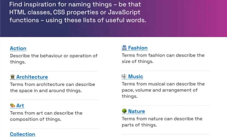
For teams struggling to standardize, several open-source resources have emerged to provide a framework for naming conventions. Tools such as "Classnames" offer a thematic repository of terminology that encourages developers to think outside of rigid, technical constraints. By categorizing terms based on behavior, association, and ordering, these resources help teams move away from visual-only naming toward functional-based naming.
The industry has seen a pivot toward "semantic naming." Instead of naming a variable based on its current visual state (e.g., red-text), modern design systems prioritize the function (e.g., status-error-color). This shift is critical for scalability; if a brand decides to change its error color from red to orange, a semantic naming convention allows the system to update globally without requiring manual code changes across every instance.

Case Study: The Intuit Design Token Strategy
The challenge of multi-brand, multi-product environments is perhaps best exemplified by the work performed at Intuit. With a portfolio including QuickBooks, TurboTax, and Mailchimp, the company faced the arduous task of creating a design token system that could support diverse user bases while maintaining a unified core.
The Intuit team developed a multi-layered taxonomy that separates primitive tokens (base values like hex codes) from semantic tokens (usage-based values). This structure allows for "theming" at scale—enabling the company to apply different visual identities to various products while drawing from a shared, foundational design system. This approach is widely considered the gold standard for enterprise-level organizations, as it minimizes the risk of breaking downstream implementations when individual product teams need to pivot.

Data-Driven Insights and Component Standardization
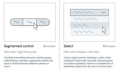
The "Component Gallery," curated by Iain Bean, provides an empirical look at how the world’s leading design systems name their common UI elements. By analyzing over 50 components across major frameworks, the gallery highlights a critical reality: there is no single "correct" name, but there is a "community consensus."
For instance, a simple input field might be labeled "text-input," "text-field," or "input-control" depending on the organization. The data shows that high-performing teams tend to align their names with the "mental model" of the user rather than the technical architecture of the code. When names mirror the language users employ to describe their tasks, discoverability increases significantly.

The Correlation Between Naming and Feature Adoption
A significant, often overlooked, aspect of naming is its impact on feature adoption. User experience research conducted by practitioners like Erin Gannon indicates that features often fail not because they are poorly designed, but because they are poorly labeled. If a feature’s name does not clearly communicate the "job-to-be-done," users are less likely to integrate it into their existing workflows.
The process of naming features should be an exercise in linguistics:
- User Discovery: Conduct interviews to understand the specific vocabulary users associate with the problem the feature solves.
- Outcome-Oriented Labeling: Focus the name on the value proposition rather than the technical implementation.
- Iterative Testing: Treat feature names like copy—A/B test the nomenclature to see which terminology resonates most effectively with the target demographic.
Structural Frameworks for Modern Teams
For organizations looking to implement a more robust system, the Vodafone UK Design System team has provided a blueprint through their "Variables Taxonomy Map." By creating a hierarchy that flows from "Brand" and "Primitives" to "Semantics" and finally to "Pages," teams can create a map that is both intuitive and deeply functional.
This hierarchical approach ensures that when a change is made at the primitive level, its impact on the higher-level components is immediately traceable. This transparency is vital for large-scale projects, as it prevents the "spaghetti code" effect where an update to one file causes unforeseen visual issues in a distant part of the application.

The Path Forward: Best Practices for Consistent Naming
To minimize the confusion that leads to technical debt and user frustration, organizations should prioritize the following strategies:
- Implement a "Single Source of Truth": Utilize tools like Figma’s token-management plugins or centralized documentation portals to ensure all team members access the same naming conventions.
- Audit for Conflict: Periodically review the design system for naming collisions. If two components share similar names but perform different functions, initiate a naming sprint to clarify the distinction.
- Encourage Cross-Functional Collaboration: Naming should not be an isolated task for designers. It requires input from developers (who need to write the code) and product managers (who need to communicate the feature).
- Adopt "Living" Documentation: A naming system is never static. It must evolve as the product grows. Establish a process for adding, deprecating, and renaming tokens as the business requirements change.
Conclusion and Future Implications
The discipline of naming UI components is, at its heart, an act of translation. It is the bridge between human intention and machine execution. As design systems continue to mature and become more complex, the ability to maintain a clear, consistent, and scalable nomenclature will become a competitive advantage. Teams that invest in defining their "language" early will spend less time debugging misunderstandings and more time delivering value to their users. By leveraging existing research, standardized tools, and a user-centric approach to terminology, organizations can mitigate the risks of fragmentation and build digital products that are as coherent in their code as they are in their design.