Rethinking Digital Wellness: Why UI Trends Fail Mental Health Apps and What Design Principles Truly Matter

The burgeoning landscape of digital mental health applications faces a critical, yet often overlooked, challenge: a profound disconnect between prevalent user interface (UI) design trends and the unique needs of individuals seeking support. Despite their noble intent to provide accessible mental health care, these apps suffer from alarmingly high abandonment rates, largely attributed to design choices that prioritize aesthetic innovation over therapeutic efficacy. Kat Homan, a leading voice in user experience for mental health, highlights this fundamental conflict, introducing an insightful evaluation framework designed to help designers assess whether popular visual and interaction patterns genuinely support or inadvertently undermine the sensitive goals of mental health experiences.
The Silent Crisis of Abandonment in Digital Mental Health
The data paints a stark picture of user disengagement in the digital mental health sector. Studies reveal that nearly 95% of users who initially download and open a mental health application abandon it within 30 days, with a median 30-day retention rate plummeting to a mere 3.3%. Even well-established mental health platforms, often lauded for their clinical backing and comprehensive offerings, reportedly lose approximately 50% of their user base within the first ten days. This severe collapse in engagement and retention underscores that effective interface design is not merely an aesthetic consideration but a paramount clinical and operational priority. It is a fundamental tool for user retention and, by extension, for delivering sustained therapeutic value.

The proliferation of mental health apps has been a significant development in recent years, spurred by increased awareness, reduced stigma, and the global demand for accessible care, especially following periods of collective stress like the COVID-19 pandemic. However, this rapid growth has not always been accompanied by a deep understanding of the unique psychological states of their target users. Research indicates that many mental health apps have historically prioritized visual appeal – an attempt to signal innovation and stand out in a crowded market – at the expense of features that genuinely sustain user engagement. For individuals grappling with stress, anxiety, overwhelm, or exhaustion, trendy, attention-grabbing designs can inadvertently introduce additional cognitive strain, eroding the utility and trust that are indispensable for these applications to be effective. An unconventional icon, a confusing gesture, or a flashy animation, far from being a delightful surprise, can become an additional cognitive burden, often leading to disengagement.
The Fundamental Conflict: Trend-Driven Design vs. Therapeutic Usability

The core tension lies in the divergent objectives of general UI trends and mental health app design. While conventional UI trends often aim to capture attention, signal innovation, and encourage exploration, mental health design must fundamentally strive to offer refuge, reduce cognitive strain, and build unwavering trust. Pursuing the former without careful adaptation can directly compromise the latter. This is not a superficial issue of color or font; it represents a foundational conflict of purpose that manifests across several critical fronts, each capable of costing more engagement than it seeks to create.
Kat Homan’s framework, grounded in extensive research on mental health app engagement, cognitive load, accessibility, and emotional response in mHealth, alongside competitive product audits and real-world product work, provides a robust lens for evaluation. It posits that a design’s success in this sensitive domain hinges on whether it reduces effort, preserves user agency, avoids emotional mismatch, and remains fully usable even when the user is under significant strain.

1. Cognitive Friction: When Design Becomes a Barrier to Healing
The primary objective of any mental health tool should be to reduce cognitive load, not amplify it. Yet, many contemporary interfaces, driven by trends, often achieve the opposite. Design patterns such as neo-brutalist layouts, characterized by stark contrasts and unconventional structures, demand intense visual parsing. Hidden navigation menus that rely on non-standard swipes transform simple tasks into perplexing puzzles. Abstract, unlabeled icons force users into a guessing game rather than enabling immediate recognition. Each of these patterns introduces friction – moments of hesitation or confusion – which, for a user whose mental energy is already depleted, accumulate into a significant burden.

This friction is particularly detrimental during moments of acute need. Studies suggest that when an individual is experiencing high anxiety or depression, even basic actions like typing or making simple choices can feel overwhelming. An interface that demands high cognitive effort at such a crucial juncture doesn’t merely make that session harder; it provides an overwhelmed user with a compelling reason to close the app and, crucially, a reason not to reopen it. Each point of confusion can become a permanent exit point. Conversely, research consistently shows that apps with simpler, intuitive interfaces reduce the time and effort required to engage, directly improving retention and fostering healthy habit formation.
This does not imply that mental health products must be visually austere. The key is ensuring the interface meets the user’s current capacity. A panic-support tool, for instance, is most effective when it presents a limited number of obvious actions, not a browsing experience. If a calming action is unexpectedly interrupted by an upgrade screen, the app fails the user at their most vulnerable moment. The issue is not monetization itself, but its untimely intrusion into a moment of expected immediate support.

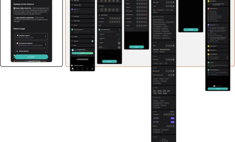
Examples like Nonori demonstrate the power of linear flows, guiding users through simple, sequential actions to reduce the effort needed to begin. In contrast, comprehensive tracking apps like Bearable, while powerful for managing chronic conditions, can overwhelm exhausted users with dense dashboards and multi-step check-ins, demanding executive capacity that might be diminished by anxiety or brain fog. Similarly, visually rich home screens in anxiety apps, while potentially engaging during exploration, can obscure the path to support when users are in distress.
This understanding informed the design of Bear Room, a stress and anxiety reduction app, and Teeni, an emotional-wellbeing app for parents. Bear Room offers both mood-based selection and a prominent voice input option, allowing users to choose the path of least resistance based on their state. Teeni introduces a "Quick Relief" button, initiating a "Hot Flow" for immediate emotional venting via voice, followed by a gentler "Cold Flow" for reflection. These solutions prioritize meeting users at their current capacity, removing mechanical and cognitive barriers, thereby fostering a reliably non-judgmental and genuinely helpful experience.

2. Emotional Mismatch: The Trust Erosion of Misaligned Design Tone
A mental health app operates within the sensitive context of a user’s emotional state, necessitating an empathetic and considerate visual language. Research into the impact of color and aesthetics on mood in mHealth apps reveals a strong user preference for subtlety. Users in distress often gravitate towards dark palettes, sleek and sophisticated aesthetics, and clean, uncluttered interfaces. Bright, cheerful colors, while seemingly positive, can create a jarring and even physically uncomfortable conflict with their current mood, leading to a sense of emotional invalidation.

The choice of emotional tone must align with the product’s purpose and the likely state of its users. A playful style might suit a self-care app focused on habit building, but it would be a poor fit for a trauma-support tool. The mismatch can also extend to mechanics. For example, Calmer, an anxiety relief app, incorporates discount wheels or confetti celebrations after a user logs a low mood. This abrupt shift from quiet support to an upsell or celebratory animation can feel incongruous and undermine trust, regardless of the developer’s intent.
In designing Bear Room, direct user feedback consistently highlighted a desire for a "digital safe space," with many finding existing apps "too bright, too happy, and too overwhelming." This led to a muted palette of earthy tones and calming backgrounds, intentionally avoiding bright alerts or sudden animations. The goal was to create a grounded, safe, and emotionally low-friction atmosphere, where calmness is the core feature. Trust is built when the interface respectfully aligns with the user’s emotional reality, offering solace through subtlety rather than overwhelming them with saturation.

3. The Inconsistency Penalty: Why Novelty Undermines Routine
Mental health management often relies heavily on routine and predictability, providing a sense of stability and control. Conversely, many contemporary UI trends thrive on novelty and disruption, frequently reimagining fundamental navigation patterns. When an app introduces unique swipe gestures or non-standard button behaviors, it forces users to learn a new interaction model before they can access support, imposing cognitive effort they may not be able to afford.

While an app can certainly possess character and playfulness, its identity must remain understandable and predictable for users returning in a low-capacity state. A gamified self-care app like Finch might be engaging for an exploratory user, but its non-skippable celebration screens, designed for delight, become an unwelcome obstacle for someone simply trying to mark a task after a difficult day. Similarly, extensive content libraries in meditation apps like Headspace and Calm, while valuable for exploration, can become navigational labyrinths for a distressed user seeking immediate, specific support.
Users experiencing anxiety or executive dysfunction require straightforward navigation, not an interface they must relearn with each visit. PTSD Coach, a public-health-oriented trauma-support app, exemplifies effective design by prioritizing a stable information architecture. Its clearly separated sections for learning, symptom tracking, symptom management, and support offer predictability that is invaluable for users in distress. CALMzone also demonstrates how novel interactions can be beneficial when they directly support the exercise (e.g., breathing animations guiding inhales and exhales) rather than distracting from it.

In Bear Room, navigation reliability was treated as a therapeutic feature. The interface was structured as a clear, guided flow, with familiar objects representing emotional support tools. These visual cues ensure users can easily access what they need and remember their way around the digital space upon subsequent returns. Trend-driven interfaces that sacrifice this navigational certainty for novelty risk creating fatigue and prompting users to abandon the practice of seeking digital support altogether. Innovation should serve the user’s state, not interrupt it.
4. The Silent Exclusion: How Trends Compromise Accessibility

Many popular UI trends, when applied without thoughtful adaptation, can be inherently exclusionary. The minimalist trend of low-contrast text, for instance, significantly hinders users with visual impairments. Gesture-only navigation marginalizes those with motor difficulties. Visually dense, rapidly animated interfaces can overwhelm users with cognitive or attentional conditions. This is particularly problematic in mental health, where the population needing support disproportionately includes individuals with such accessibility needs.
Choosing a trending aesthetic over an accessible one is a critical decision that actively limits an app’s reach and efficacy, ensuring that those who could benefit most are unable to use the tool effectively. Accessibility is not an afterthought; it is a foundational design constraint. Adherence to Web Content Accessibility Guidelines (WCAG 2.2), which specify requirements like 4.5:1 contrast ratios for body text (3:1 for large text and interface elements) and minimum interactive target sizes of 24×24 pixels (or larger for unsteady hands), is crucial. Furthermore, every gesture-based interaction should have a visible button fallback to prevent excluding users unable to perform complex swipes.

5. The Coercion Paradox: When "Engagement" Becomes "Pressure"
A final, and often underestimated, consequence of uncritical trend adoption is the integration of engagement mechanics borrowed from entertainment, education, or productivity apps. Features like streaks, aggressive notifications, and gamified reward systems, while effective for maximizing screen time and fostering dependency in other contexts, can be profoundly misguided in mental health. What is presented as "motivation" can quickly transform into a source of performance pressure and guilt. For a user managing depression, a broken streak or a missed daily goal can exacerbate the very feelings the app aims to alleviate.

These mechanics are not inherently unethical, and in specific routine-building contexts, they can be beneficial. However, their transfer into mental health domains without adapting for shame, low energy, relapse, and the non-linear nature of recovery carries significant risks. A streak, for a vulnerable user, becomes more than a retention metric; it can become a visible record of their perceived success or failure in maintaining their well-being.
Persuasion patterns such as streak freezes, commitment-based copy, urgency-driven notifications, and "Yes, I want to succeed" buttons, while common in consumer apps, can make a mental health tool feel less like a supportive ally and more like another system demanding compliance. Designers must still implement return triggers, as an unused mental health app provides no value. However, these mechanics must be carefully adapted to the emotional context. Bear Room, for example, employs short, forgiving three-day streaks that do not reset immediately upon a missed day, and every third day offers a small benefit. The goal is to gently support return, not to punish absence. Similarly, its optional bubble-popping game is deliberately finite, offering a brief, calming interlude rather than aiming for extended, addictive engagement.

In mental health technology, sustainable retention is earned not by capturing fleeting attention, but by becoming a consistently respectful, reliable, and genuinely helpful presence in a user’s life.
The Scale of the Stakes: A Global Imperative

This issue is far from a niche concern. The World Health Organization (WHO) estimates that over one billion people globally live with a mental disorder, with depression alone affecting nearly 5% of adults. Alarmingly, the overall prevalence is rising, with depression and anxiety cases increasing by 25% in the last decade. This vast and vulnerable population cannot afford for its digital support tools to fail due to poorly considered design. While UI trends are not inherently problematic, their application within wellbeing products demands a radically contextual approach, where the aesthetic choices directly serve the user’s immediate emotional state and therapeutic goals.
Lifting a visually striking "Dribbble shot" – a designer’s portfolio piece – and applying it without deep adaptation carries the highest risk. Such a practice solves for the designer’s portfolio, not the user’s profound need. Even a five-minute decompression tool, however sophisticated its target audience, operates within an emotional context. Soft biomorphic shapes or fluid transitions can genuinely aid calm when they directly serve that goal; the same elements become noise when their primary purpose is to impress or signify novelty.

A Practical Framework for Ethical and Effective Design
The five critical fronts outlined – cognitive friction, emotional mismatch, inconsistency penalty, silent exclusion, and coercion paradox – form a practical and ethical evaluation framework for anyone designing in the mental health space. Before integrating any trendy visual or interaction pattern, designers should rigorously assess it against these principles:

- Does it reduce cognitive load, especially when the user is distressed?
- Does its emotional tone align respectfully with the user’s likely state and the app’s therapeutic purpose?
- Does it maintain navigational predictability and support routine, rather than introducing disruptive novelty?
- Is it fully accessible to users with diverse visual, motor, and cognitive needs?
- Does it motivate without creating pressure, guilt, or dependency?
A design that successfully navigates all five of these checkpoints transcends mere usability. It evolves into a trustworthy tool that users will consistently return to in moments of genuine need, fostering sustainable engagement and delivering real therapeutic impact. Ultimately, the goal in mental health design is not for the interface to be noticed or admired, but for the profound support it offers to be genuinely felt.