Mastering Vector Icon Alignment with Tailwind CSS: A Deep Dive into Achieving Pixel-Perfect UI Harmony.

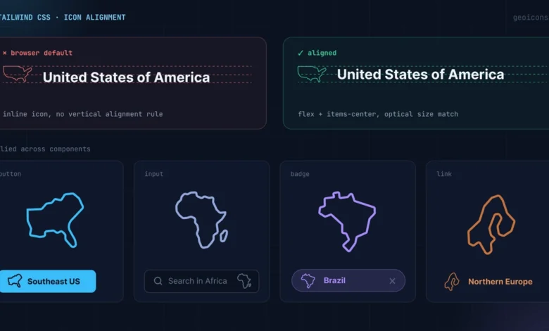
Vector icons, while indispensable for modern web interfaces, often pose a subtle yet persistent challenge for developers: achieving perfect visual alignment with adjacent text labels. Unlike typographic characters, which inherently possess a consistent baseline, ascender, and descender, graphic paths within an SVG lack these predefined vertical metrics. Consequently, simply placing an icon next to text using default browser rendering typically results in the icon appearing to float incongruously above or below the text baseline, creating a disjointed and unprofessional aesthetic. This article explores a robust and elegant solution to this common UI dilemma, leveraging the power of Tailwind CSS flexbox utilities and relative sizing, exemplified through the use of GeoIcons components.
The Enduring Challenge of Icon Alignment in Web Development
The quest for pixel-perfect icon-text alignment is not new. In the early days of web development, when graphics were primarily raster images, developers often resorted to imprecise methods like adjusting vertical-align properties, which frequently led to inconsistent results across different browsers and font sizes. The advent of icon fonts offered a partial solution, as they brought icons into the typographic realm, allowing them to inherit font properties and baselines. However, icon fonts introduced their own set of complexities, including issues with accessibility, performance (loading entire font files for a few glyphs), and limited customization options.
The widespread adoption of Scalable Vector Graphics (SVG) revolutionized iconography on the web. SVG provides numerous advantages: infinite scalability without loss of quality, smaller file sizes compared to raster images, ease of styling with CSS, and enhanced accessibility. Despite these benefits, SVG icons inherently exist within a canvas or viewport, and their visual content might not be perfectly centered within that canvas, nor does their bounding box naturally align with the baseline of surrounding text. This fundamental mismatch between the graphic’s bounding box and the text’s typographic baseline is the root cause of the alignment problem. Developers using raw inline SVG elements often find that the bottom edge of the SVG’s canvas aligns with the text baseline, pushing the icon visually upward.
Modern CSS layout techniques, particularly Flexbox, have provided powerful tools to overcome these alignment hurdles. Flexbox offers unparalleled control over the distribution and alignment of items within a container, making it a natural fit for addressing the vertical centering of disparate elements like icons and text. Tailwind CSS, a utility-first CSS framework, further streamlines this process by providing a comprehensive set of pre-built Flexbox utilities, enabling developers to implement sophisticated layouts with minimal custom CSS.
Tailwind CSS and GeoIcons: A Synergy for Precision UI
The examples discussed here utilize GeoIcons components, a library offering clean, optimized map outlines for all countries and regions. What makes GeoIcons particularly relevant for this discussion is that each shape represents a real geographic outline, not a uniform square glyph. This means their internal visual weight and proportions vary significantly, pushing the alignment challenge beyond simple square icons and making the solutions applicable to a broader range of complex vector graphics. The GeoIcons components conveniently expose size and className props, facilitating easy integration and styling with Tailwind CSS.
The core methodology for achieving impeccable icon-text alignment with Tailwind CSS can be distilled into three fundamental principles: anchoring the visual centers using Flexbox, matching the icon’s size to the text’s line height, and correcting any asymmetric visual weight with precise translation adjustments.
1. Anchoring the Visual Centers with Flexbox
The first step in achieving harmonious icon-text alignment is to ensure that both the icon container and the text block are vertically centered relative to each other. A standard block layout would simply stack these elements, while raw inline SVG elements would typically align their bottom edge with the text baseline, causing the icon to appear misaligned.
The solution lies in wrapping the icon and the text within a container element and applying Flexbox utilities. By adding display: flex (via Tailwind’s flex utility) and align-items: center (via Tailwind’s items-center utility) to the parent container, the browser intelligently aligns the vertical midpoints of all child elements. This immediately resolves the most common issue of icons floating off-center.
Consider a simple CountryBadge component:
import  Jp  from '@geoicons/react/countries';

export default function CountryBadge()
  return (
    <div className="flex items-center gap-2">
      <Jp size=20 aria-hidden="true" />
      <span>Japan</span>
    </div>
  );
In this snippet, flex establishes a flex container, and items-center ensures that both the <Jp> icon component and the <span>Japan</span> text are vertically aligned along their respective midpoints. Furthermore, the gap-2 utility, which translates to a consistent 0.5rem or 8px horizontal space, adds a visually pleasing and consistent separation between the icon and the text, preventing them from feeling cramped. This approach aligns with fundamental principles of visual design, where consistent spacing and alignment contribute significantly to a clean, organized, and professional user interface. Studies in human-computer interaction consistently show that well-aligned elements reduce cognitive load and improve the perceived usability and trustworthiness of a digital product.
2. Matching Icon Size to Line Height
The second critical step involves scaling the icon’s height to precisely match the text’s line height, rather than its font size. This distinction is crucial for correct vertical rhythm. Standard Tailwind body text, for instance, often uses the text-base class, which typically defines a font-size of 16px and a line-height of 24px. If an icon’s height is set to 16px to match the font size, it will visually sit within a 24px vertical container, leading to a subtle but noticeable vertical mismatch. The icon would appear too small relative to the total vertical space occupied by the text line.
To achieve optimal balance, the icon’s height should be set to match the line-height of the surrounding text. For a text-base class with a 24px line height, an icon height of 20px or 24px would be appropriate, depending on the desired visual emphasis and spacing. The example provided suggests a 20px icon for a 24px line height, which allows a small amount of vertical padding around the icon, ensuring it doesn’t visually collide with text lines above or below, especially in multi-line contexts.
/* For text-base (24px line-height), use a 20px icon */
<div className="flex items-center gap-2 text-base leading-6">
  <Us className="h-5 w-5" aria-hidden="true" />
  <span>United States</span>
</div>

/* For text-sm (20px line-height), use a 16px icon */
<div className="flex items-center gap-2 text-sm leading-5">
  <Us className="h-4 w-4" aria-hidden="true" />
  <span>United States</span>
</div>
Here, h-5 w-5 translates to height: 20px; width: 20px;, and h-4 w-4 to height: 16px; width: 16px;. The leading-6 and leading-5 utilities explicitly set the line height, making the alignment predictable. This careful consideration of typographic metrics ensures that the icon occupies a proportional visual space relative to the text, contributing to a balanced and professional appearance. Design systems often document these relationships rigorously, providing developers with clear guidelines for icon sizing based on text styles.
3. Correcting Asymmetric Visual Weight
The third principle addresses a more nuanced aspect, particularly relevant for icons like GeoIcons, which represent diverse geographic shapes. Unlike perfectly symmetrical glyphs, real-world outlines like countries possess unique proportions. A long, narrow country such as Italy or Chile will sit differently within its square SVG canvas than a more compact country like France or Poland. While the browser centers the bounding box of the SVG element, the visual weight or perceived center of the actual graphic path within that bounding box might be slightly off-center. This subtle imbalance can lead to a visually jarring effect, even after applying Flexbox centering.
To achieve true visual harmony, a minor, pixel-level adjustment might be necessary. This can be accomplished using relative translation classes provided by Tailwind CSS.
import  It  from '@geoicons/react/countries';

export default function ItalyListRow()
  return (
    <div className="flex items-center gap-2">
      <It className="h-5 w-5 translate-y-[1px]" aria-hidden="true" />
      <span>Italy</span>
    /div>
  );
In this example, translate-y-[1px] shifts the vector shape down by a single pixel. This seemingly minor adjustment can be crucial for centering the visual weight of the path relative to the uppercase characters of the text label, which typically define the highest point of the text. This "pixel-perfecting" step, while often subjective, is a hallmark of meticulous UI design, ensuring that every element contributes to an overall sense of balance and precision. Many experienced UI developers understand that while programmatic centering gets you 90% there, the final 10% often requires these subtle manual nudges based on visual perception.
Practical Applications: Common UI Patterns
The three principles—flex centering, size matched to line height, and an optional pixel nudge—are universally applicable across various UI components.
Buttons:
Buttons are interactive elements where clear and aesthetically pleasing presentation is paramount. When integrating an icon into a button, the button itself usually defines its own line-height and padding. The strategy here is to leverage inline-flex items-center for the button’s internal layout. The icon should inherit the button’s text size, but be sized slightly smaller than the text’s line-height. This ensures the icon acts as a visual companion, complementing the text rather than competing with it for attention. Crucially, if the button’s text already conveys the icon’s meaning (e.g., "Ship to Japan" with a Japan flag icon), the icon should be marked with aria-hidden="true" to prevent screen readers from redundantly announcing its presence, thereby improving accessibility.
import  Jp  from '@geoicons/react/countries';

export default function ShipToButton()
  return (
    <button
      type="button"
      className="inline-flex items-center gap-2 rounded-md bg-slate-900 px-4 py-2 text-sm font-medium text-white"
    >
      <Jp className="h-4 w-4" aria-hidden="true" />
      Ship to Japan
    </button>
  );
List Rows:
In lists, consistent vertical alignment is critical for readability and visual scanning. Any misalignment, no matter how subtle, will be magnified when repeated down an entire column, creating a cluttered and unprofessional appearance. The approach for list rows involves setting a consistent icon size for the entire list and applying the same alignment method to every row. This ensures that the visual center of each icon remains locked, regardless of the unique proportions of individual country outlines. The shrink-0 utility is particularly useful here; it prevents the icon from being compressed or squeezed when a particularly long country name wraps to a second line, thereby maintaining the crisp alignment of the list’s left edge. This consistency is vital for user experience, as it allows users to quickly and efficiently parse information.
import  It  from '@geoicons/react/countries';
import  Us  from '@geoicons/react/countries';
import  Jp  from '@geoicons/react/countries';

const countries = [
   code: 'US', name: 'United States', Icon: Us ,
   code: 'IT', name: 'Italy', Icon: It ,
   code: 'JP', name: 'Japan', Icon: Jp ,
];

export default function CountryList()
  return (
    <ul className="divide-y divide-slate-200">
      countries.map(( code, name, Icon ) => (
        <li key=code className="flex items-center gap-3 py-2 text-base">
          <Icon className="h-5 w-5 shrink-0" aria-hidden="true" />
          <span>name</span>
        </li>
      ))
    </ul>
  );
Inputs:
For input fields, such as a country selection field, integrating an icon typically involves placing it inside the input area. This requires absolute positioning for the icon and padding for the text to prevent overlap. The vertical centering of the icon within the input field can be achieved reliably using top-1/2 combined with a -translate-y-1/2 nudge. This combination ensures that the icon remains perfectly centered vertically, irrespective of the input field’s height. Furthermore, the pointer-events-none utility is crucial for usability, allowing mouse clicks and touch events to pass through the icon directly to the underlying input field, ensuring it remains fully focusable and editable. This sophisticated positioning technique elevates the aesthetic and functionality of form elements.
import  Us  from '@geoicons/react/countries';

export default function CountryInput()
  return (
    <div className="relative">
      <Us
        className="pointer-events-none absolute left-3 top-1/2 h-5 w-5 -translate-y-1/2"
        aria-hidden="true"
      />
      <input
        type="text"
        defaultValue="United States"
        className="w-full rounded-md border border-slate-300 py-2 pl-10 pr-3 text-base"
      />
    </div>
  );
Inline with Text:
When an icon needs to be seamlessly integrated within a sentence, it’s best to define its width and height using em units. This ensures the icon automatically scales with the surrounding font size, maintaining visual proportionality. Classes like h-[1em] w-[1em] dynamically adjust the icon’s size relative to the parent text’s font-size. A small translate-y-px adjustment can then precisely position the icon on the text baseline, achieving perfect inline flow. This method is particularly powerful for creating rich, informative textual content where visual cues are seamlessly interwoven.
import  It  from '@geoicons/react/countries';

export default function InlineMention()
  return (
    <p className="text-base">
      Our team just opened a new office in' '
      <span className="inline-flex items-center gap-1 font-medium">
        <It className="h-[1em] w-[1em] translate-y-px" aria-hidden="true" />
        Italy
      </span>
      .
    </p>
  );
Broader Impact and Implications
The systematic application of these alignment principles, facilitated by Tailwind CSS, has significant implications for web development and user experience.
Developer Efficiency and Design System Consistency: By providing a clear, reusable pattern for icon-text alignment, developers can rapidly build consistent UI components. This approach significantly reduces the time spent on "pixel-perfecting" individual elements, allowing for faster iteration and development cycles. Furthermore, these patterns can be codified within a design system, ensuring a cohesive and predictable visual language across an entire application or suite of products. The declarative nature of Tailwind CSS utilities makes it easy to maintain and scale these visual guidelines.
Enhanced User Experience (UX): While seemingly minor, precise visual alignment contributes immensely to the perceived quality and professionalism of a user interface. A well-aligned interface feels polished, trustworthy, and intuitive. It reduces visual clutter and makes content easier to scan and comprehend, ultimately leading to a more pleasant and efficient user experience. In a competitive digital landscape, these subtle cues can differentiate a product.
Accessibility: The emphasis on aria-hidden="true" for decorative icons is a crucial aspect of inclusive design. It ensures that screen readers do not redundantly announce visual elements that are already conveyed by accompanying text, preventing cognitive overload for users relying on assistive technologies.
Future Trends: As CSS continues to evolve, with features like container queries and more advanced typographic controls, the pursuit of perfect UI alignment will only become more sophisticated. However, the fundamental principles of understanding element boxes, baselines, and visual weight will remain constant. Utility-first frameworks like Tailwind CSS are well-positioned to adapt to these changes, abstracting away complexities and providing developers with efficient tools for modern UI construction.
In conclusion, achieving precise vertical alignment between vector icons and text is a nuanced but essential aspect of crafting high-quality user interfaces. By understanding the inherent challenges of graphic paths versus typographic baselines and systematically applying the principles of Flexbox centering, matching icon size to line height, and making fine-tuned visual weight adjustments, developers can overcome these hurdles. The combination of GeoIcons components with Tailwind CSS utilities offers a powerful and efficient workflow to consistently implement these solutions across various UI patterns, from buttons and lists to input fields and inline text. This approach not only streamlines development but also elevates the overall user experience by delivering visually harmonious and professional digital products, where every icon sits exactly where it should.