Magnetic Commerce: Dash Creative Unveils Revolutionary Rebrand and Immersive Website Experience

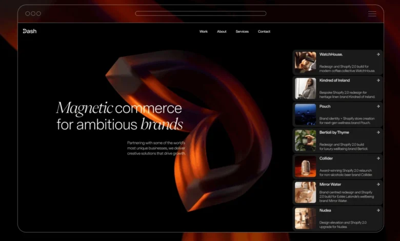
Dash Creative, a prominent digital agency, has officially launched its comprehensive rebrand and a cutting-edge new website, setting a new benchmark for interactive digital experiences. The strategic overhaul, culminating in the "magnetic commerce" concept, aims to fundamentally redefine how businesses connect with their audiences online. The new platform showcases a sophisticated blend of design philosophy and technical prowess, featuring a highly interactive 3D logo, iOS-inspired UI elements, and a groundbreaking WebGL-powered hero background that dynamically responds to user input. This initiative reflects Dash Creative’s commitment to creating digital experiences that not only inform but actively "draw people in," fostering deeper engagement and conversion.
The Strategic Imperative: Why a Rebrand?
For any evolving entity in the fast-paced digital landscape, periodic reevaluation of brand identity is crucial. Dash Creative’s decision to undergo a significant rebrand stemmed from a desire to achieve greater market differentiation and more accurately reflect its core capabilities. In an increasingly competitive agency environment, merely "looking different" is insufficient; the brand needed to embody its unique value proposition. The leadership recognized that while their services delivered exceptional results, their previous brand identity might not have fully articulated the sophisticated, engaging nature of their work.
The objective was clear: to craft an identity that not only stood out visually but also conceptually owned the essence of their impact on client success. This strategic move aligns with broader industry trends where agencies increasingly leverage their own digital presence as a primary portfolio and a testament to their innovative capabilities. According to recent industry reports, companies that invest in strong branding and user experience often see a significant uplift in customer loyalty and market share, with studies indicating that a consistent brand presentation across all platforms can increase revenue by up to 23%. Dash Creative aimed to harness this potential, transforming their own digital face into a compelling demonstration of their expertise.
Unveiling "Magnetic Commerce": A Core Concept
The extensive rebranding process led to the development of a powerful and concise central concept: "magnetic commerce." This idea posits that truly great digital experiences transcend mere information dissemination. Instead, they possess an inherent ability to attract, engage, and retain users, much like a magnetic force. This philosophy became the bedrock for every subsequent design and development decision.
The new logo, a testament to this concept, features a subtle yet impactful visual: part of the "D" is subtly pulled inward, symbolizing the magnetic attraction the brand aims to create for its clients’ customers. This emblem was not just a static image but a dynamic starting point, dictating motion, interaction, and visual language across the entire digital ecosystem. This conceptual clarity is a significant asset, providing a unified vision that permeates all aspects of the brand’s communication and service delivery. This approach resonates with contemporary marketing principles that emphasize experiential branding, where the interaction itself becomes part of the brand message.
Chronology of a Transformative Project
The comprehensive project spanned several months, encompassing various stages from conceptualization to final deployment. The initial phase focused heavily on brand strategy and concept development, where the "magnetic commerce" idea rapidly crystallized. This foundational step, while seemingly swift, involved intensive internal workshops, market research, and competitive analysis to ensure the concept resonated with both Dash Creative’s internal vision and external market demands.

Following concept approval, the design phase commenced. This involved translating "magnetic commerce" into tangible visual elements, starting with the logo and extending to typography, color palettes, and overall user interface architecture. The brand guidelines, though strict, proved to be a valuable constraint, preventing design drift and encouraging more deliberate and refined solutions. This structured approach, common in high-stakes design projects, ensures that creativity remains aligned with strategic objectives.
The most time-consuming phases were content generation, animation refinement, and development implementation. Crafting compelling and concise copy that aligned with the new brand voice required meticulous effort. Simultaneously, bringing the intricate animations, particularly the hero background and logo interactions, to life demanded significant technical expertise and iterative refinement. This iterative process, typical of high-fidelity web development, ensured that every interactive element functioned seamlessly and contributed meaningfully to the overall user experience. The project’s successful completion underscores the importance of a phased approach, where each stage builds systematically upon the last, culminating in a cohesive and impactful digital product.
Design Philosophy and User Experience Innovation
Beyond the core concept, Dash Creative adopted several innovative design principles to enhance user experience. A key decision was to draw inspiration from iOS design language for handling elements like project cards and Calls-to-Action (CTAs). The project cards, for instance, were deliberately designed to evoke iOS notifications – familiar, tactile, and subtly unexpected within the context of a website portfolio. This approach aimed to create an intuitive yet fresh user experience, leveraging users’ existing mental models for digital interaction while injecting a distinctive brand flavor. This strategy aligns with findings that suggest users respond positively to familiar UI patterns, which can reduce cognitive load and improve usability.
The brand guidelines, while stringent, were embraced as a creative catalyst. Instead of limiting creativity, these constraints pushed the design team towards more considered and impactful solutions, ensuring consistency and reinforcing the "magnetic" theme throughout the site. This disciplined approach is a hallmark of successful branding efforts, where clarity and consistency amplify the brand’s message. It demonstrates how well-defined boundaries can paradoxically foster greater innovation by narrowing the focus and demanding more inventive solutions within those parameters.
Technological Mastery: Tools and Implementation
The development of Dash Creative’s new website is a masterclass in leveraging a sophisticated tech stack to achieve ambitious design goals. The choice of tools was deliberate, reflecting both practical considerations and a desire to showcase the platform’s capabilities to prospective clients.
- Figma for Design: The design phase heavily relied on Figma. Its collaborative features and robust component-based system were instrumental in maintaining systematic control over typography, spacing, and reusable components. This ensured design consistency and facilitated rapid iteration, crucial for a project with strict brand guidelines and complex interactive elements. Figma’s ability to manage design systems effectively allowed the team to adhere to the brand’s visual language without stifling creative exploration. Its real-time collaboration features also streamlined communication between designers and developers, reducing handover friction.
- Webflow for the Build: As Dash Creative’s own site, using Webflow served a dual purpose: it was a practical choice for their team’s expertise and a powerful demonstration of the platform’s potential for clients. The majority of the site’s interactions were implemented using Webflow’s native animation system, highlighting its growing capabilities for creating dynamic web experiences without extensive custom code. This decision also underscores a trend in the industry towards low-code/no-code platforms that empower designers and developers to build complex sites more efficiently, accelerating development cycles.
- GSAP for Advanced Interactions: While Webflow handled much of the animation, certain highly precise, cursor-driven behaviors and complex sequencing required the power of GreenSock Animation Platform (GSAP). GSAP is renowned in the web development community for its performance and flexibility in creating custom, high-fidelity animations. Its integration allowed Dash Creative to achieve nuanced interactions that would have been challenging or impossible with Webflow’s native tools alone, ensuring a truly premium feel. GSAP’s robust API allowed for granular control over animation timing, easing, and sequencing, essential for the "magnetic" effects.
- Custom WebGL for the Hero Background: The pièce de résistance of the site’s technical implementation is undoubtedly the custom WebGL hero background. This highly specialized component, responsible for the dynamic, distorting video surface, could not be achieved with standard web technologies or even GSAP. WebGL, a JavaScript API for rendering interactive 2D and 3D graphics within any compatible web browser without the use of plug-ins, was essential for this visually striking and performance-intensive feature. This choice demonstrates Dash Creative’s commitment to pushing the boundaries of web interactivity and offering unique, immersive experiences.
The Hero Background: Distorting a Live Surface – A Technical Deep Dive
The hero background represents a significant technical achievement, transforming a seemingly simple video into a dynamic, interactive surface. The core idea was to use a fullscreen video as a texture and distort it in real-time based on cursor movement, without it becoming a distraction from the main content.

Design Intent vs. Implementation:
Crucially, the team avoided a simple "ripple" effect centered on the cursor. Instead, the distortion was engineered to carry momentum, propagating in the direction of cursor movement, creating the impression of a surface being physically "pulled" rather than just reacting to a hover. This subtle distinction significantly enhances the perceived tactility and responsiveness of the interaction, aligning perfectly with the "magnetic commerce" concept.
Fragment Shader Power:
The entire effect is implemented within a fragment shader, a small program that runs on the GPU and processes each pixel on the screen. Instead of applying post-processing effects, the shader directly manipulates the video’s texture coordinates. This direct manipulation is highly efficient, as it occurs at the pixel level on the graphics card, leading to smooth, high-performance visuals even on various devices.
The fragment shader leverages several key parameters, defined in a SETTINGS object, which allow for fine-tuning the distortion’s characteristics:
radius: Defines the immediate area of influence around the cursor.amplitude: Controls the intensity of the distortion wave.frequency: Determines how many waves or ripples appear within the distorted area.speed: Influences the animation speed of the wave.carry: Dictates how far the distortion propagates in the direction of movement.stagger: Adds a subtle offset to the wave, creating a more organic feel.centerPowerandverticalDampPower: These values control the falloff and directionality of the distortion, ensuring it doesn’t spread uniformly and maintains a focused, magnetic pull.motionGainandspeedDecay: Critical for the persistence effect, these parameters manage how cursor motion is translated into distortion and how quickly the distortion dissipates.
The geometry for this effect is surprisingly simple: a single fullscreen quad. This minimalist approach reduces computational overhead, focusing the GPU’s power on the complex shader calculations.
The Shader Logic:
The core of the distortion lies in a few lines of GLSL (OpenGL Shading Language) within the fragment shader.
maskFn(vec2 uv): This function calculates the influence mask. It determines the distance (dist) of a pixel from the smoothed cursor position (uMouseSm), adjusted for aspect ratio (uAspect).smoothstepcreates a smooth transition for the mask, andpowallows for controlling the intensity falloff, creating a natural gradient of influence.wavecalculation: Asinfunction is used to generate the actual wave pattern. It incorporates the pixel’s UV coordinates (d.y), the direction of cursor movement (dot(d, dir) * uCarry), and time (uTime * uSpeed) to create a dynamic, propagating wave. Thedotproduct helps align the wave propagation with the cursor’s velocity vector.d += dir * (wave * amp * maskFn(uv) * damp): This crucial line applies the distortion. The calculated wave, modulated by the amplitude (amp), the influence mask (maskFn(uv)), and vertical damping (damp), is added to the texture coordinates in the direction of cursor movement (dir). This remaps where the video texture is sampled for each pixel, creating the visual distortion.
Motion Direction and Persistence:
To prevent the effect from feeling "snappy" and mechanical, the interaction state is smoothed and decayed on the JavaScript side before being passed to the shader. motionTarget decays over time, and mappedMotion limits its influence. This motion value, along with smoothed direction vectors (dirSm), ensures that the distortion gradually loses momentum, giving it a more organic and continuous feel, akin to a physical medium responding to force. This attention to detail in motion physics is a hallmark of truly engaging interactive design and contributes significantly to the perceived quality of the experience.

Visual Restraint: A Design Principle
Despite its technical complexity, the hero background adheres to a principle of visual restraint. The effect is designed to add depth and dynamism without overwhelming the primary content (typography). The soft falloff of the influence field avoids a harsh "spotlight" effect, and vertical damping ensures the wave’s directional shape, contributing to a refined aesthetic. By keeping the rest of the hero section minimalist – a black background, a full-bleed video, and the direct application of the shader – the focus remains on the innovative interaction itself. This strategic minimalism allows the advanced technical features to shine without competing for user attention, embodying the principle that interaction should support the concept, not distract from it.
Architectural Simplicity and Efficiency
The underlying architecture of the hero section is remarkably straightforward, a testament to efficient engineering. It consists of a simple HTML structure: a <section> container housing a hidden <video> element (the texture source) and a WebGL <canvas> layered above.
The renderer, built without relying on complex scene graphs or post-processing pipelines, performs five core tasks:
- Initialization: Setting up the WebGL context, shaders, and buffers.
- Texture Management: Loading the video element as a texture.
- Uniform Updates: Passing dynamic values (cursor position, direction, time) to the shader.
- Drawing: Rendering the fullscreen quad with the distorted texture.
- Animation Loop: Requesting the next animation frame (
requestAnimationFrame) for continuous updates.
This lean approach, working with a single texture, a fullscreen quad, and a pair of shaders, ensures high performance and makes it relatively easy to integrate into a production environment. Crucially, rendering doesn’t begin until the video is fully readyState >= 2, preventing broken visual states and ensuring a smooth initial load. The entire render loop is kept lightweight through careful optimization: interaction values are smoothed, UV coordinates are directly remapped, and the canvas is scoped only to the hero section. This modular and efficient design ensures that the same sophisticated approach can be readily adapted for different video sources or distortion profiles across various sections of a website, showcasing a scalable solution for interactive design.
Reflections and Industry Implications
The successful launch of Dash Creative’s new website provides valuable insights for the broader web design and development community. The project reinforced the core belief that interaction is most effective when it inherently supports the overarching brand concept, rather than existing as a standalone gimmick. As a spokesperson for Dash Creative stated, "Our goal was never to create animations for the sake of it, but to weave them into the very fabric of our ‘magnetic commerce’ philosophy. Every pull, every ripple, is designed to communicate our value proposition intuitively."
A significant challenge identified during the project was the temptation to continuously add new effects. The team found that subtle adjustments to timing, easing functions, and content refinement often yielded more significant impact than introducing entirely new interactive elements. This highlights the importance of "knowing when to stop" and focusing on polish over proliferation of features—a common pitfall in visually driven projects.

One key learning point for future projects involves the reliance on cursor interaction. While highly effective for desktop users, the experience naturally differs on touch devices. Dash Creative acknowledges that considering touch-first interactions earlier in the design process, rather than adapting later, would be a beneficial refinement. This reflects a critical aspect of modern web development: ensuring truly universal accessibility and experience across diverse input methods, especially as mobile browsing continues to dominate global internet traffic.
The rebrand and website launch position Dash Creative as a thought leader in creating immersive and effective digital experiences. The "magnetic commerce" concept, brought to life through sophisticated technical execution, serves as a compelling case study for how agencies can leverage their own platforms to demonstrate innovative capabilities. This trend of agencies using their websites as live portfolios of advanced techniques is likely to grow, pushing the boundaries of what is expected from a modern digital presence. The project also underscores the increasing demand for developers proficient in specialized areas like WebGL, as brands seek more unique and engaging ways to capture user attention in a crowded digital marketplace. The meticulous attention to detail, from conceptualization to the final animation polish, exemplifies the level of craftsmanship required to build truly memorable and impactful digital products in the current era, thereby raising the bar for digital experiences across industries.