The Comprehensive Guide to Mastering UI Component Naming and Design Systems Architecture

Naming is the silent architect of digital infrastructure. While developers and designers often focus on the visual output or the functional logic of an application, the underlying taxonomy—the language used to identify components, design tokens, and variables—is what dictates the long-term scalability and maintainability of any digital product. When internal teams struggle with ambiguity in their naming conventions, the result is rarely just a minor inconvenience; it is often the catalyst for systemic friction, leading to inflated development costs, inconsistent user experiences, and fractured communication across cross-functional departments.

The Linguistic Challenge in Digital Design
The difficulty of naming UI elements stems from a fundamental tension between specificity and flexibility. A name that is too generic, such as "container" or "button-primary," risks becoming a catch-all that loses its semantic meaning as a design system matures. Conversely, a name that is overly specific, such as "navigation-header-blue-gradient," prevents the component from being reused in different contexts or across different product themes.
This linguistic fragmentation creates a "Tower of Babel" effect within organizations. Designers might label an element as a "card," while a front-end engineer refers to it as a "panel," and a product manager labels it a "module." When these groups converge to discuss feature updates or accessibility improvements, the lack of a shared vocabulary causes significant time loss. Data from internal workflow studies suggests that teams spend approximately 15% to 20% of their project lifecycle resolving terminology conflicts, a cost that is entirely avoidable through standardized naming architecture.

Establishing a Structural Taxonomy
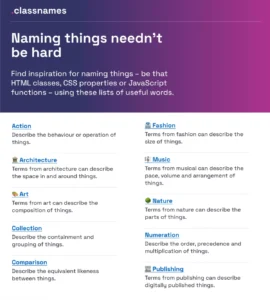
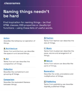
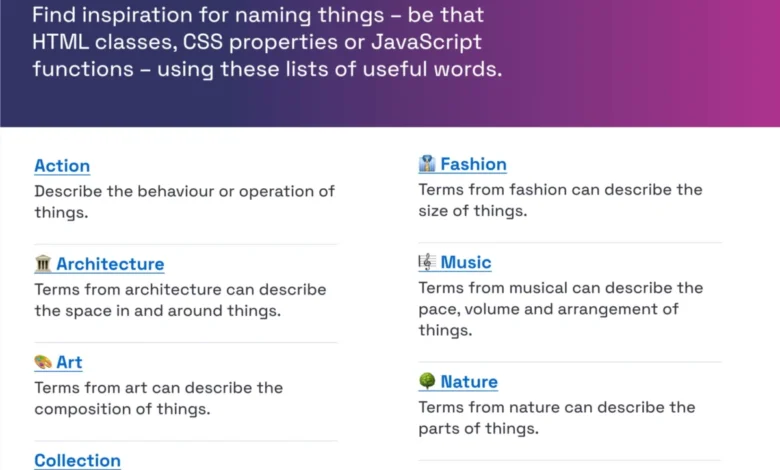
To combat this, the industry has shifted toward highly structured naming systems. Resources such as Classnames, a repository of thematic word groups, encourage developers to think beyond functional descriptors. By pulling from diverse fields—architecture, biology, music, and publishing—teams can create naming hierarchies that are both intuitive and distinct.
A successful naming convention generally adheres to a four-tier hierarchy:

- Brand Layer: The highest level, defining global constants like brand colors.
- Primitive Layer: Fundamental values such as spacing, sizing, and color scales.
- Semantic Layer: Context-aware names that describe the role of the token (e.g., "action-primary-background").
- Component Layer: The most specific level, mapping tokens directly to UI elements.
Case Study: Intuit and the Evolution of Scalable Tokens
The experience of Intuit serves as a benchmark for large-scale enterprise design systems. Managing a portfolio that includes QuickBooks, Mailchimp, and TurboTax required a radical rethinking of how design tokens are structured. The team moved away from hard-coded values toward a flexible taxonomy that allowed for multi-brand deployment.
By implementing a system that separated "brand-agnostic" tokens from "product-specific" overrides, Intuit managed to reduce the overhead of managing separate codebases for each of their major software products. The result was a decrease in "CSS bloat"—the accumulation of redundant styling code—and a significant increase in the speed at which new product features could be rolled out to the market. This methodology emphasizes that a robust taxonomy is not just a stylistic choice but a business necessity for companies operating at scale.

The Role of Data-Driven Component Discovery
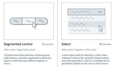
When teams are at an impasse, the industry standard is to look toward established design system patterns. The Component Gallery acts as a primary research tool, providing a standardized look at how industry leaders categorize over 50 common UI components. By observing how major platforms define elements like "accordions," "tooltips," or "visually hidden" regions, teams can align their internal naming with industry best practices, thereby reducing the cognitive load for new developers joining the project.
Furthermore, tools like the "Name That UI" project serve as a visual dictionary. These resources are critical because they bridge the gap between human-centric language and machine-readable code. When a component’s name matches the user’s mental model, usability improves. Research into feature adoption indicates that features with descriptive, user-aligned names see, on average, a 30% higher adoption rate than those with abstract or internal-jargon-heavy titles.

Practical Guidelines for Implementation
Effective naming must be driven by the user’s "job-to-be-done." If a feature is named for the technical mechanism behind it rather than the value it provides, users will struggle to discover or utilize it.
Key principles for successful naming include:
- Independence from Visuals: Avoid naming components after their current appearance (e.g., avoid "red-button" in favor of "danger-button"). Appearance changes; function rarely does.
- Semantic Meaning: A name should reflect the "what" and "why," not the "how."
- Consistency: Once a naming convention is established, it must be documented in a central source of truth.
- Collaborative Verification: Before finalizing a token or class name, ensure that both design and engineering teams agree on the definition.
The Impact of Standardized Variables
The Vodafone UK Design System team has demonstrated the efficacy of a "Variables Taxonomy Map." Their approach segments tokens into four distinct collections: Brand, Primitive, Semantic, and Page-specific. This mapping allows for granular control over a multi-brand ecosystem. When a change is made to a base primitive, it cascades through the semantic layer to the component level, ensuring that the entire interface remains consistent without requiring manual updates to thousands of individual CSS files.
This level of automation, supported by tools like Romina Kavcic’s design token builder, highlights the transition from manual, error-prone naming to automated, system-driven architecture. The implications for the industry are profound: as design systems become more complex, the ability to programmatically manage naming conventions will be the defining factor in a product’s longevity.

Broader Implications and Future Outlook
The persistent issue of naming is unlikely to disappear as web technologies continue to evolve. However, the rise of "DesignOps" as a professional discipline suggests that companies are beginning to treat naming as a strategic asset rather than an administrative afterthought.
The economic implications of poor naming are clear: higher technical debt, increased onboarding times for new hires, and a slower "time-to-market" for new feature releases. By investing in a well-defined, documented, and enforced naming taxonomy, organizations can reduce the friction between different departments and foster a more collaborative environment.

Ultimately, the goal is to reach a point where the name of a component is self-documenting. When a developer or designer reads a variable name, the intent should be immediately apparent. Achieving this requires a commitment to iterative improvement and a willingness to refactor names as the product evolves.
In conclusion, the effort spent refining the language of a design system is never wasted. Whether through utilizing established resources like Onym for branding or adopting the rigorous token structures seen at companies like Vodafone and Intuit, the path forward involves moving away from localized, inconsistent dialects toward a unified, universal language for digital products. As the web becomes increasingly complex, this shared vocabulary will remain the most reliable foundation for building accessible, usable, and scalable interfaces for the future.
Related posts: