Effective brand identity design, particularly in the complex landscape of digital products, rarely originates from spontaneous aesthetic inspiration. Instead, its strongest visual concepts are meticulously forged in a crucial "pre-concept phase," a period dedicated to rigorous inquiry, contextual research, and stakeholder alignment that precedes any tangible visual creation. This often-overlooked stage serves as a vital bridge, translating abstract strategic objectives into a concrete visual foundation, thereby mitigating project failures and ensuring that design efforts are precisely targeted and impactful.
The "Pre-Concept" Imperative: Bridging Strategy and Visuals
The genesis of a branding project’s failure frequently occurs long before designers even contemplate a logo or color palette. It resides in the strategic vacuum where foundational terms like "modern," "trustworthy," "premium," "friendly," or "disruptive" are left open to individual interpretation. This ambiguity creates a significant chasm between a brand’s intended communication and the designer’s expected output. This critical juncture, where clarity is paramount yet often absent, defines what industry experts increasingly refer to as the "pre-concept phase."
Typically, designers embark on a project armed with a brief, a few stakeholder conversations, competitor analyses, and perhaps a mood board or a list of adjectives. From these inputs, they are tasked with generating visual concepts that "feel right." However, the subjective nature of "right" renders objective judgment nearly impossible when the core team has not collectively defined the brand’s intended message. Without a shared understanding of what these broad descriptors truly mean in context, creative endeavors risk misalignment and eventual rejection.
Consider the example of a health tech company that sought a brand identity embodying "modern," "trustworthy," and "disruptive." Initially, "disruptive" might evoke images of bold, unconventional, or even rebellious aesthetics. Yet, through deeper engagement during the pre-concept phase, it became apparent that "disruption" for this client had to maintain credibility within a fundamentally conservative healthcare environment. Their primary clientele consisted of large government medical institutions, where overtly rebellious or visually loud branding would inadvertently erode trust rather than build it. In essence, their version of "disruptive" leaned more towards traditional perceptions of reliability and efficiency than the word typically suggests. This illustrates a common pitfall: the language itself wasn’t "wrong," but its inherent breadth proved insufficient to guide specific design decisions. Before any strategy can be visually translated, these broad terms must be meticulously refined: "What kind of modern? Trustworthy in what specific way? Disruptive compared to whom? And how far can the brand diverge from category norms before alienating its target audience?"

This indispensable pre-concept work, occurring after project kickoff but prior to the first visual direction, extends beyond mere strategy. It encompasses thorough research into the brand’s context, the systematic uncovering of hidden assumptions among stakeholders, and the meticulous process of transforming shared direction into a tangible visual foundation. It is a practical and strategic intermediary, bridging the gap between what the brand needs to communicate and how it might authentically appear. The initial forum for constructing this bridge is typically the brand workshop, where broad discovery is distilled into a precise understanding of the brand’s operational context.
Unearthing Deeper Perceptions: The Role of Strategic Inquiry
A standard brand workshop naturally covers essential discovery topics: business goals, product or service specifics, the competitive landscape, and target audience demographics. However, the efficacy of this phase hinges not merely on collecting facts but on clarifying perception. As renowned brand strategist Marty Neumeier posits in The Brand Gap, "A brand is a person’s gut feeling about a product, service, or company." If a brand’s ultimate existence is in the minds of its audience, then the workshop’s paramount objective must be to define the precise perception the team aims to cultivate.

The critical questions within this phase transcend simple fact-gathering; they delve into clarifying what beliefs the brand must inspire, where its credibility must reside, and which category conventions it should embrace or challenge. These perception-focused inquiries are vital because brand attributes, though seemingly aligned, are frequently misunderstood. When a stakeholder asserts the brand should feel "premium," there might be collective nodding, but individual interpretations can diverge wildly: one might envision refined and editorial, another expensive and exclusive, and yet another clean, quiet, and minimalist. The shared word masks disparate visual systems.
Revisiting the health tech project, the client’s desire for a "disruptive" brand initially suggested a bold, unconventional visual approach. However, given their audience of large government medical institutions, "disruption" was ultimately expressed through clarity, efficiency, and unwavering confidence, rather than overt rebellion. Had the design team taken "disruptive" at face value without this contextual clarification, the visual direction could have easily veered into territory that undermined audience trust. Similarly, a fintech team aiming for a "bold" yet "credible" brand faced a productive tension. "Bold" could imply vibrant colors and oversized typography, but in the financial sector, it simultaneously had to convey security, control, and competence. The challenge was not whether to be bold, but what kind of boldness would resonate as trustworthy. When these attributes are defined within their specific context, designers transition from working with vague adjectives to solving clearly articulated design problems.
Engaging Stakeholders: Practical Exercises for Visual Alignment

While strategically chosen questions can reveal much of the verbal layer, words alone are rarely sufficient. To effectively transition from linguistic strategy to visual direction, incorporating exercises that compel stakeholders to think through images, associations, and relative perceptions proves invaluable. Jake Knapp, in GV’s Three-Hour Brand Sprint, underscores this point, stating, "The point of these exercises is to make the abstract idea of ‘our brand’ into something concrete." These exercises actively engage stakeholders, preventing passive agreement that often masks underlying assumptions. When clients must actively position a competitor on a map, select an image, or articulate why a reference feels credible, their individual attitudes, beliefs, and potential disagreements surface constructively, preempting conflicts during later concept reviews. The process typically begins by examining the broader category before focusing inward on the brand itself.
Exercise 1: Competitor Perception Mapping
Prior to the workshop, a curated collection of competitor brand visuals—screenshots of websites, product interfaces, social media presence—is assembled. During the workshop, client teams are tasked with placing these competitors on a simple two-axis map. This exercise isn’t about judging "good" or "bad" design; it’s about discerning how the client perceives the category: what signals credibility, what appears generic, what feels overly conservative or too experimental, and crucially, where potential visual white space exists for their own brand. The axes are custom-chosen to reflect key tensions relevant to the brand. For instance, a health tech company aiming for innovation within a conservative sector might use "Traditional to Progressive" and "Corporate to Human." A fintech brand balancing boldness with trust might opt for "Understated to Bold" and "Accessible to Exclusive." The most potent outcome of this exercise is often not the final map itself, but the productive disagreements it sparks. One stakeholder might perceive a competitor as progressive, while another dismisses it as generic. Such divergences illuminate fundamental differences in how individuals define innovation, trust, and differentiation—ambiguities that are imperative to resolve before design commences.
Exercise 2: Visual Brand Driver
Following the category discussion, the focus shifts inward with the "Visual Brand Driver" exercise. Stakeholders are asked to select images representing the company across a diverse set of unrelated categories: transport, typeface, activity, furniture, mood, object, animal, architecture, and drink. A critical instruction here is that the selections must represent the company, not personal aesthetic preferences. For example, if the company were a form of transport, would it be a quiet electric car, a high-speed train, a private jet, or a bicycle? If it were a piece of furniture, would it be a soft lounge chair, a precise modular desk, or a heavy boardroom table? After image selection, each participant adds four or five adjectives explaining their choices. This explanation is often more insightful than the image itself, as the same object can carry varied meanings: a train might signify speed, structure, or mass accessibility, while a lounge chair could suggest comfort, calm, or informality. This exercise builds a deeper layer of brand perception by prompting metaphorical and associative thinking, revealing patterns and contradictions. One stakeholder might envision a refined and calm brand, while another sees an energetic and experimental one. These differences are not problems but valuable insights, highlighting areas that demand clarification before the visual concept phase. This exercise also effectively separates brand perception from personal aesthetic bias, reinforcing the guiding question throughout the branding process: "Does this express the right thing about the brand?" rather than "Do I personally like this?"

Translating Insight into a Visual Foundation: The Pre-Concept Review
Once the workshop has unearthed critical assumptions and fostered a shared understanding, the subsequent client meeting transforms this understanding into a concrete visual foundation. This stage still precedes the creation of the first identity concept; it serves as a working layer between strategy and design, allowing the client to react to proposed perceptions, visual principles, and early asset directions before significant design investment. This meeting is typically structured around three interconnected layers: Look and Feel, Design Code, and Brand Assets, collectively moving the conversation from abstract perception to practical design boundaries.
Crafting "Look and Feel" Boards: Guiding Perception, Not Prescribing Design
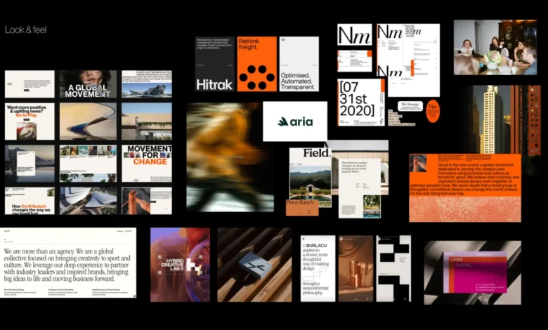
"Look and feel" boards are not mere collections of visuals deemed aesthetically pleasing by the team. They are perception boards, curated by the designer based on workshop insights: desired perception, category tensions, competitor codes, identified stakeholder disagreements, and the brand’s emerging character. If a brand aims to be trustworthy, modern, and human, the board facilitates a discussion on the specific nature of that trust, modernity, and humanity. Is the brand calm and institutional, or warm and accessible? Is its progressiveness conveyed through precision, or through a more expressive, editorial tone? The objective is to elicit client reactions to the perception itself, dissociating it from reactions to a fully formed logo, color palette, or visual system.

Defining "Design Code": Metaphors into Visual Principles
"Design code" makes the visual direction more specific by translating key brand ideas into actionable visual principles. For a parenting app in Germany, the strategic idea of "personalized support for your unique journey" might translate into organic shapes, handwritten lines, and softer compositions. "Parenting is messy and magical" could inspire soft gradients, layered imagery, and playful irregularity. "Research-backed support for real life" might introduce elements like doctor calls, data snapshots, infographics, and editorial layouts that bolster the brand’s credibility. For a PR agency specializing in prop tech, "momentum in motion" might manifest as dynamic lines, arrows, ripple effects, or motion blur. "Springboard" could suggest lift-off moments and elastic visual energy, while "building blocks" might lead to modular shapes or stacked compositions. At this stage, the team isn’t selecting final graphic expressions but validating whether the proposed visual metaphors align with the strategic intent before the extensive work of concept design begins.
Early "Brand Assets" Direction: Establishing Practical Boundaries
The final layer narrows the conversation to the fundamental building blocks of identity: typography, color palettes, logo style, photography, illustration, and overarching graphic language. Here, the team can address questions such as: "Should the brand lean into photography or illustration, and what style? Should the typography be traditional and authoritative, or modern and approachable? How will color be used to differentiate or create emotional resonance? What kind of graphic language will reinforce the brand’s unique message?" This iterative process provides the designer with crucial boundaries without prematurely making the final identity predictable. The subsequent step remains concept design, but the team is now operating from a position of shared clarity, free from vague adjectives or unspoken expectations.
Implications of a Robust Pre-Concept Phase

A meticulously executed pre-concept phase offers profound implications for the success and efficiency of brand identity projects. Firstly, it significantly reduces the likelihood of rework and costly revisions. By preemptively resolving ambiguities and aligning perceptions, design teams can proceed with greater confidence, leading to more targeted and effective initial concepts. Industry reports frequently highlight that a substantial percentage of design projects face delays or budget overruns due to misaligned expectations or poorly defined briefs. A strong pre-concept phase directly addresses these root causes, fostering smoother workflows and optimizing resource allocation.
Secondly, it cultivates stronger brand equity. When a brand’s visual identity is deeply rooted in a shared strategic understanding, it communicates a more cohesive and authentic message to its audience. This clarity enhances brand recognition, builds trust, and fosters a stronger emotional connection, which are critical drivers of market differentiation and long-term value. Thirdly, it transforms the concept review process. Instead of subjective debates centered on personal likes or dislikes ("I like it" vs. "I don’t like it"), the conversation shifts to objective criteria: "Does this visual direction effectively express the brand we collectively agreed upon?" This elevated discourse ensures that feedback is constructive and directly contributes to refining the brand’s strategic objectives.
The Future of Brand Identity: Strategic Design in a Complex Landscape

In an increasingly saturated and complex digital landscape, where brands must communicate consistently across myriad touchpoints—from apps and websites to social media and physical spaces—the strategic foresight offered by a robust pre-concept phase is more vital than ever. The days of purely aesthetic branding are largely over; modern brand identity demands a deep integration of strategy, psychology, and visual communication. Design leaders and marketing strategists consistently emphasize that brands with clearly defined foundational principles are better equipped to adapt, innovate, and maintain relevance. This methodology empowers designers to move beyond superficial styling, enabling them to infuse meaning and purpose into every visual element.
The first concept presented should never feel like a shot in the dark or a surprising reveal. Instead, it should be perceived as a logical progression, the next step in a direction the entire team already understands and has helped to shape. This approach does not stifle intuition, experimentation, or creative risk; rather, it channels these forces towards a sharper, more defined problem. When brand character is clarified, visual perceptions are tested, ideas are translated into design principles, and early asset directions are discussed, designers can explore creative solutions with enhanced confidence and precision.
Ultimately, pre-concept work doesn’t aim to make the final identity predictable. Its true purpose is to make the conversation around it more meaningful. By moving beyond vague adjectives and unresolved disagreements, teams can engage in a higher-level dialogue: asking not whether the work matches someone’s private expectation, but whether this visual direction truly expresses what the brand needs to become in the eyes of its audience. This foundational work transforms branding from a subjective artistic endeavor into a guided, strategic creative process, ensuring that the visual identity is not just appealing, but profoundly effective.