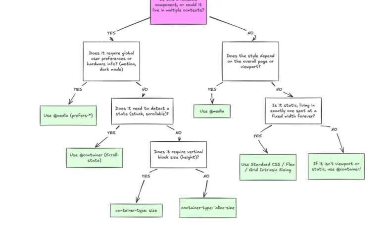
Despite broad support across all major modern web browsers—currently hovering at approximately 94%—the adoption of CSS Container Queries remains remarkably low among the professional development community. While Media Queries have been the industry standard for responsive design for over a decade, they are increasingly insufficient for modern, component-based architectures. The disparity between technical availability and actual implementation highlights a significant disconnect in how developers perceive the evolution of responsive layout strategies.
The Evolution of Responsive Design
To understand the current state of web layout, one must examine the limitations of the traditional viewport-centric model. Media Queries were introduced in CSS3 to allow developers to apply styles based on the device’s screen size. This paradigm worked effectively during the early era of responsive design, when websites were largely viewed as static documents that needed to scale up or down based on a browser window.
However, the industry has shifted toward design systems and atomic components. A component like a product card or a sidebar widget is now expected to be truly portable, functioning inside a full-width grid on a desktop, a narrow column in a dashboard, or a constrained space within a modal. Media Queries are inherently "dumb" in this context; they only perceive the browser window’s dimensions. When a card is placed inside a 300px-wide sidebar on a 1920px-wide desktop monitor, a Media Query targeting "desktop" sizes will apply the wide-layout styles, inevitably causing the component to break, overflow, or render poorly.
Industry Adoption and Technical Hurdles
Data from the 2025 State of CSS survey suggests that while awareness of Container Queries is high—reaching 86% of surveyed developers—actual usage lingers at just 41.4%. This gap indicates that the barrier to adoption is not a lack of knowledge, but rather a lack of conceptual integration.

At the SmashingConf Amsterdam 2026, industry experts noted that the adoption rate of this feature has been significantly slower than anticipated. This trend is surprising given that for years, "element queries" were the most requested feature on the CSS-Tricks wishlist. The technical community is currently stuck in a cycle of applying legacy logic to a new feature. Developers often approach Container Queries as if they were simply "Media Queries for elements," leading to common implementation errors that discourage further use.
Defining the Difference: Macro vs. Micro Layouts
A clear distinction has emerged in modern development workflows: the division between macro and micro layouts.
Macro layouts refer to the global structure of a page. This includes the main navigation, footer positioning, and the primary grid system. These elements are fundamentally tied to the browser viewport, making Media Queries the appropriate tool for managing them.
Micro layouts, conversely, refer to the individual components that populate the macro layout. These include cards, buttons, input fields, and widgets. These elements require a "context-aware" approach. By utilizing the container-type and container-name properties, developers can now instruct a component to monitor its own parent container rather than the external window. This allows a component to behave differently depending on the specific amount of inline space it is allocated, regardless of the screen size of the device.
Fluid Typography and Advanced Layout Detection
The move toward container-aware design has opened doors for more sophisticated CSS techniques. Historically, fluid typography was managed via vw (viewport width) units, which forced text to scale based on the entire screen size. This often led to text that was either too large or too small when a component was nested in a sidebar.

With the introduction of container-relative units such as cqi (container query inline-size) and cqw (container query width), developers can now use the clamp() function to scale typography relative to the component itself. This ensures that a headline remains proportional to its container, maintaining visual hierarchy regardless of where the component is placed in the DOM tree.
Furthermore, Container Queries allow for the detection of internal layout changes that were previously invisible to CSS. A common pain point in web design is detecting when flexbox items wrap to a new line. Previously, this required JavaScript-based ResizeObserver calls to track layout shifts. Today, by nesting a container query within a flex item, developers can trigger style changes the moment that specific item wraps, effectively creating a "state-aware" component without the overhead of heavy JavaScript dependencies.
Limitations and Structural Requirements
While the benefits are significant, the implementation of Container Queries requires a shift in how developers structure their markup. A critical limitation is that an element cannot act as its own container if the query is meant to style its children; the query must be applied to a parent wrapper. Developers often encounter "infinite loop" issues where they attempt to style a container based on its own dimensions, which is not supported by the CSS specification.
Additionally, developers must be cautious when using container-type: size. If a container is set to respond to block (vertical) dimensions without an explicit height, the browser will render it with a height of zero, effectively collapsing the layout. Consequently, best practices favor the use of inline-size to avoid unintended structural collapse.
Furthermore, there is currently no native way to use CSS custom properties (variables) directly within a Container Query breakpoint. This is due to the way CSS handles the cascade; if a query were to change a custom property that it simultaneously relies on, it could create an unstable cycle.

Future Implications
The broader implication of this shift is the decentralization of layout logic. As the web becomes increasingly modular, the reliance on the viewport as the "source of truth" is fading. By moving toward a model where components are self-contained, intelligent, and responsive to their direct environment, developers can build more robust and maintainable interfaces.
The ongoing low adoption rate suggests that the industry is still in a transitional period. As design systems continue to mature and become the standard for large-scale web applications, the pressure to move away from rigid, viewport-dependent layouts will grow. Experts agree that the future of responsive design is not about asking "how big is the screen?" but rather "how much space do I have here?" This paradigm shift, while requiring a learning curve, is essential for the next generation of resilient web architecture. The tools are ready; the challenge now lies in the fundamental rethinking of how components interact with the space they occupy.