
Every single month, upwards of 50,000 software developers, engineers, and technical enthusiasts from around the globe visit DavidWalshBlog. Founded by prominent developer and open-source advocate David Walsh, the platform has long served as an invaluable educational hub for mastering JavaScript tricks, troubleshooting intricate codebases, and navigating the evolving landscape of web development. However, despite its revered status within the programming community, a silent technical friction was quietly degrading the user experience. Visitors navigating the site from mobile devices and desktop computers alike were encountering frustrating performance bottlenecks—specifically, unexpected visual instability during page loading phases.
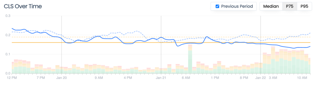
The presence of these performance anomalies came to light through continuous monitoring provided by Request Metrics, a real-world web performance tracking platform. While analyzing the telemetry data, engineers observed a concerning upward trend in the Cumulative Layout Shift (CLS) score across the entire domain. For a website dependent on delivering a seamless, distraction-free reading experience, an escalating CLS metric represented a critical technical liability. This discovery initiated a comprehensive diagnostic investigation into the root causes of the layout instability, highlighting a pervasive industry-wide challenge regarding how modern web applications render visual content and how developers measure performance optimization.
To understand the gravity of the situation, it is essential to examine the core mechanics of web performance metrics. Cumulative Layout Shift is one of the three foundational pillars comprising Google’s Core Web Vitals, alongside Largest Contentful Paint (LCP) and First Input Delay (FID), which was later succeeded by Interaction to Next Paint (INP). Introduced by Google as part of its page experience update, Core Web Vitals are designed to quantify the actual user experience on the web rather than purely technical benchmarks like raw server response times. While metrics such as LCP measure loading speed and INP evaluates interactivity, CLS focuses exclusively on visual stability.
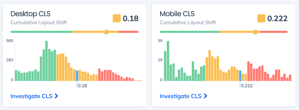
Specifically, CLS quantifies how often users experience unexpected layout shifts while a web page is still downloading and rendering. These shifts typically occur when elements—such as images, advertisements, dynamic embeds, or asynchronously loaded fonts—change their dimensions or inject themselves into the DOM (Document Object Model) after the initial render. Consequently, content that the user is already reading or attempting to click suddenly jumps to a different location on the screen. The psychological impact of layout shifts is profound; behavioral studies in human-computer interaction consistently demonstrate that visual instability makes an application feel sluggish, unpolished, and unreliable, frequently leading to accidental clicks on unintended links or buttons.
Beyond the immediate psychological friction experienced by human readers, the implications of poor Core Web Vitals extend deep into digital economics and search engine optimization (SEO). Search algorithms utilized by major engines, most notably Google Search, heavily factor user experience metrics into their organic ranking systems. For digital publishers, technology blogs, e-commerce platforms, and independent creators, search engine traffic serves as the primary lifeblood of audience acquisition and revenue generation. A degraded CLS score does not merely annoy visitors; it actively suppresses a website’s visibility in search engine results pages (SERPs), leading to diminished organic reach, lower readership numbers, and a compounding cycle of performance decay. Recognizing these stakes, the collaborative effort between Walsh and the Request Metrics analysis team sought to isolate the precise triggers of the layout shifts, rectify the underlying code, restore optimal user experience, and safeguard the blog’s search engine standing.
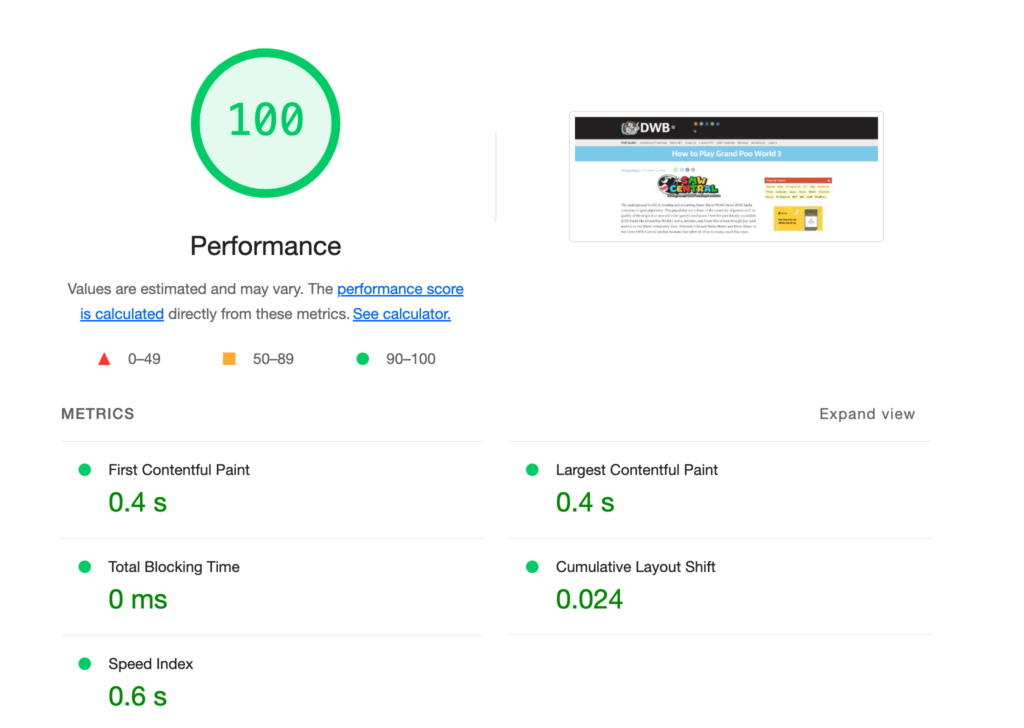
The investigation into DavidWalshBlog’s performance metrics initially presented a paradoxical diagnostic challenge, a scenario familiar to many veteran web developers. When engineers attempted to evaluate the site’s performance using Google Lighthouse—the industry-standard automated auditing tool integrated into browser developer tools—the resulting report appeared flawless. Lighthouse returned a near-perfect performance score across all audited categories, suggesting that the web pages loaded instantly and without visual disruption. For an inexperienced developer, this glowing audit report would typically signal that the platform required no further optimization, justifying inaction and maintaining the status quo.
However, industry experts maintain that relying exclusively on synthetic auditing tools like Google Lighthouse is a perilous strategy for modern web development. Synthetic testing environments operate under idealized conditions: they execute single-run audits from high-end computing hardware, leveraging lightning-fast broadband connections, and accessing the server from geographically advantageous locations. In the case of the Lighthouse audit performed on DavidWalshBlog, the test reflected the optimal performance experienced by a developer sitting in a high-bandwidth zone in the United States, utilizing a modern desktop processor.
This synthetic reality diverges sharply from the heterogeneous experiences of real-world users. DavidWalshBlog’s readership spans a diverse global demographic, accessing content across a vast spectrum of hardware specifications, operating systems, and network conditions—ranging from high-end 5G mobile devices in urban centers to throttled 3G connections in developing regions or legacy smartphones struggling to parse complex JavaScript bundles. Under these authentic, variable conditions, performance degradation emerges. This discrepancy underscores the indispensable value of Real User Monitoring (RUM). Unlike synthetic benchmarks, RUM continuously collects telemetry data from actual browsers visiting the site in the wild, aggregating real-world performance metrics across diverse geographies and devices. Without implementing RUM telemetry, administrators remain entirely oblivious to the silent performance penalties suffered by their actual audience.
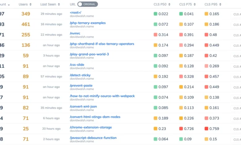
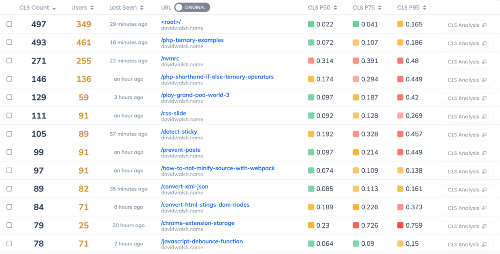
Armed with real user monitoring data rather than idealized synthetic benchmarks, the engineering team transitioned from general site-wide observation to granular page-level analysis. Because David Walsh has maintained an active publishing schedule for over a decade, archiving hundreds of technical tutorials, code snippets, and deep-dive articles, a holistic site-wide average performance score was insufficient for diagnostic purposes. Request Metrics enabled developers to isolate performance telemetry down to individual URL paths, identifying precisely which pages exhibited anomalous CLS behavior.
The telemetry data revealed a fascinating operational dichotomy. The root domain and homepage—which accounted for the highest volume of aggregate traffic—demonstrated exemplary CLS performance, maintaining a stable layout throughout the loading cycle. Conversely, numerous archived articles and deep-link tutorials—such as the highly-trafficked pieces covering specific game development walkthroughs and industry interviews—exhibited chronically troubling CLS scores. By utilizing element-level tracking features within the monitoring platform, engineers isolated the specific DOM nodes responsible for the layout shifts. In the vast majority of poorly performing articles, the primary culprit was traced to the structural selector main > article > p. Specifically, the opening paragraphs of the article bodies were actively shifting position during the page load sequence.
This finding prompted an immediate investigation into the common denominators shared among the articles suffering from severe layout instability. The common thread across these specific posts was overwhelmingly clear: media-rich content. The articles with the highest CLS scores contained numerous embedded graphics, code screenshots, and explanatory diagrams.
To understand why rich media causes layout instability, one must examine the rendering behavior of modern web browsers. When an HTML document is parsed by a browser, the rendering engine constructs the DOM tree and begins laying out elements based on available CSS rules. Historically, if an <img> tag was embedded within an article without explicit dimension attributes, the browser allocated zero space for the image during the initial layout phase, assuming its dimensions were 0x0 pixels. Once the image file was fully downloaded across the network, the browser finally registered its true height and width dimensions. To accommodate the newly arrived image, the rendering engine was forced to dynamically reflow the surrounding document layout—pushing subsequent paragraphs, headings, and sibling elements downward or outward.
On articles featuring multiple images distributed throughout the text, this cycle repeated iteratively. As each individual image completed its asynchronous download, the article body underwent successive layout shifts, causing text to jump erratically while the user was actively attempting to read. For a developer visiting a technical blog to parse complex programming logic, text shifting unpredictably under their cursor represents a severe usability barrier.
Mitigating Cumulative Layout Shift caused by asynchronous media requires adherence to established web standards regarding image rendering and resource allocation. To prevent layout reflows, the rendering engine must be provided with explicit dimensional metadata before the image file itself is downloaded over the network. By informing the browser of an image’s exact proportions in advance, the rendering engine can immediately reserve the precise amount of viewport space required for that asset within the document layout, ensuring that surrounding text remains static even if the image takes several seconds to load over a throttled connection.
In standard HTML markup, this is achieved by explicitly defining the width and height attributes directly on the <img> element, rather than relying solely on responsive CSS styling rules:
<img src="/path/to/image.png" width="800" height="400" alt="Descriptive alt text" />Industry best practices dictate that these attributes must be declared as unitless integer values representing intrinsic pixel dimensions, which simultaneously establishes the correct aspect ratio for responsive scaling via CSS stylesheets. Omitting the explicit CSS unit specifier (such as px) allows modern browsers to compute the aspect ratio natively, ensuring that the image scales fluidly across varying screen sizes while maintaining its reserved layout footprint during the initial load phase.
Because DavidWalshBlog operates on the WordPress content management system, implementing this fix required addressing both historical content archives and automated publishing workflows. Rather than manually editing hundreds of legacy posts, developers leveraged native WordPress core functions designed to programmatically inspect media assets. Specifically, utilizing the wp_image_src_get_dimensions function—alongside standard WordPress image rendering filters—allowed the platform to automatically extract the native dimensions of uploaded images and inject the requisite width and height attributes directly into the generated HTML markup.
Following the deployment of these infrastructural code modifications, performance telemetry platforms began recording immediate, measurable improvements in user experience metrics. Within days of updating the image rendering logic across the article templates, DavidWalshBlog’s aggregate Cumulative Layout Shift score dropped by 20 percent, settling at 0.123. This significant reduction brought the platform within striking distance of the strict "Good" threshold established by Google’s Core Web Vitals guidelines, which mandates a CLS score of 0.1 or lower for optimal user experience certification.
Despite this major technical victory, performance optimization remains an iterative, ongoing discipline rather than a one-time administrative task. Subsequent telemetry reviews indicated that while image-induced layout shifts had been successfully neutralized, secondary performance challenges remained—notably, layout shifts associated with asynchronous web font loading and third-party script execution. These remaining bottlenecks represent the next phase of technical refinement for the platform.

The successful remediation of DavidWalshBlog’s layout instability offers a broader, highly instructive case study for digital publishers, software architects, and enterprise web development teams. In an era where user attention spans are exceedingly brief and search engine algorithms increasingly prioritize user experience telemetry over traditional keyword optimization, technical debt related to frontend performance carries severe business consequences. The episode demonstrates that relying exclusively on synthetic testing tools like Google Lighthouse creates a false sense of security, masking real-world friction experienced by global audiences on diverse hardware.
By embracing real user monitoring platforms, developers can bridge the gap between idealized development environments and the messy, heterogeneous reality of the open web. Furthermore, the systematic identification and resolution of layout shifts underscore the fundamental importance of foundational web standards—such as explicit asset dimensioning—in building resilient, accessible, and high-performing digital infrastructure. As web standards continue to evolve and user expectations for digital speed intensify, proactive performance monitoring and disciplined frontend engineering will remain critical determinants of online visibility and audience retention.