Unlocking Native Modals: How the HTML Popover Attribute is Revolutionizing Web Development Without JavaScript

Modals and popover components have remained foundational elements of user interface design for over two decades, helping web developers optimize both desktop and mobile user experiences by stacking content dynamically and fetching asynchronous data on demand. Despite their widespread utility, the implementation of these components has historically required verbose JavaScript frameworks, complex state management libraries, or convoluted event listeners to handle accessibility, focus trapping, and z-index layering. However, modern web standards have quietly evolved to solve this friction. The W3C and browser engine implementers have rolled out a native browser feature via the HTML popover attribute and the corresponding popovertarget mechanism, offering a streamlined, lightweight alternative that fundamentally shifts how frontend developers approach overlay design.
The introduction of native popover capabilities addresses long-standing performance and maintenance bottlenecks in web engineering. For years, development teams relied on custom UI components or heavy third-party dependencies simply to display a floating dialog box or contextual menu. By integrating these capabilities directly into the HTML and CSS specifications, standards organizations have reduced the cognitive and computational load associated with standard web applications. This shift not only accelerates development velocity but also significantly enhances runtime performance by minimizing unnecessary DOM manipulation and heavy JavaScript execution cycles.
The HTML Architecture of Native Popovers
Implementing a native modal or popover in modern HTML requires minimal markup, relying on semantic relationships rather than programmatic event bindings. The architecture hinges on two primary attributes: popovertarget and popover.

To establish a functional trigger-and-target relationship, a developer designates a standard interactive element—typically a button—and assigns the popovertarget attribute to it. The value of this attribute must strictly match the unique identifier (id) of the target element that will serve as the popover container. The target element itself simply requires the bare popover attribute.
<!--
  "popovertarget" attribute maps directly to the "id" of the popover contents
-->
<button popovertarget="popover-contents">Open Popover</button>
<div id="popover-contents" popover>
  This is the native content of the popover container.
</div>
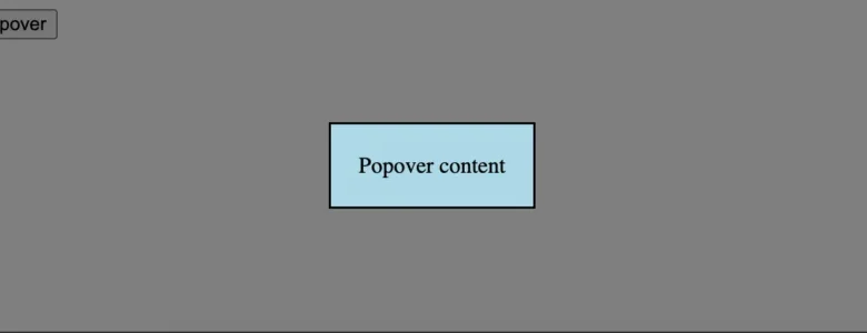
When a user interacts with the designated trigger button, the browser automatically manages the visibility state of the target element, transitioning it into the top layer of the document viewport. This native behavior eliminates the traditional requirement for writing custom click handlers, toggling CSS display or visibility classes, and managing complex ARIA attributes for screen reader accessibility.
Crucially, the native popover element initially renders without a traditional background masking layer or modal scrim. While the structural display logic is handled entirely by the browser, developers retain full creative control over the visual presentation, requiring targeted styling to establish the classic dimmed background effect associated with modal dialogs.
Styling the Popover and Top Layer Backgrounds
While the structural behavior of the popover is governed by browser-level logic, aesthetic customization relies on standard CSS declarations combined with specialized pseudo-selectors designed for top-layer elements. Styling the inner contents of the popover container utilizes standard element selectors, allowing developers to apply padding, background colors, typography, and borders just as they would with any other standard div element.

To style the background dimming layer—often referred to as the backdrop or scrim—developers must target a specialized pseudo-element associated with the browser’s internal rendering engine.
/* Customizing the core contents of the popover */
[popover]
  background: #e0f2fe;
  padding: 24px;
  border: 1px solid #bae6fd;
  border-radius: 8px;
  box-shadow: 0 10px 15px -3px rgba(0, 0, 0, 0.1);


/* Styling the underlying modal backdrop in the top layer */
[popover]:-internal-popover-in-top-layer::backdrop
  background: rgba(0, 0, 0, 0.5);
  backdrop-filter: blur(2px);
The pseudo-selector :-internal-popover-in-top-layer::backdrop targets the graphical barrier rendered behind the popover when it occupies the browser’s top layer. Traditionally, building this specific UI pattern required inserting a separate structural DOM node to act as the overlay shield, managing its opacity independently, and ensuring it remained correctly stacked beneath the modal content via complex z-index hierarchies. The native implementation abstracts this entire workflow, ensuring that the backdrop is rendered securely and performantly within the browser’s compositor thread.
Background Context and the Evolution of Web Standards
The integration of native popover functionality is part of a broader, multi-year industry initiative led by the Open Web Docs, major browser vendors, and the WHATWG to bridge the gap between native browser capabilities and developer expectations. Historically, web standards lagged behind user experience demands, forcing developers to reinvent fundamental UI patterns on a project-by-project basis.
Before the stabilization of the popover attribute and the <dialog> element, developers faced significant architectural hurdles when implementing accessible overlays. Common challenges included:

- Focus Trapping: Ensuring that keyboard navigation (such as the Tab key) remained constrained within the modal boundary rather than bleeding out into the background document.
- Z-Index Wars: Managing conflicting stacking contexts caused by third-party widgets, sticky navigation bars, and nested component trees.
- Accessibility Compliance: Manually injecting
aria-hiddenattributes into background elements and managing screen reader focus shifts upon opening and closing components. - Click-Outside-to-Close: Writing custom event listeners on the
windowordocumentobject to detect whether a user clicked outside the bounding box of a dropdown or modal.
The rollout of native popover mechanics directly resolves these architectural challenges. By shifting state management and accessibility tree adjustments into the browser engine, the W3C has drastically reduced the boilerplate code required to build robust web applications.
Chronology of Native Overlay Standards
The journey toward native popover support reflects the methodical pace of modern web standards governance:
- 2019–2020: Discussions gain momentum within the W3C and WHATWG regarding the fragmentation of modal and dropdown implementations across popular JavaScript frameworks. Engineers highlight performance penalties and accessibility inconsistencies inherent in custom userland solutions.
- 2021: Early exploratory specifications for native popover behavior are drafted, heavily influenced by the progress of the
<dialog>element. The concept of the browser "top layer"—a rendering tier that sits above all other document content regardless of standard CSS z-index values—is formalized for general use. - 2022: Major browser vendors begin experimental implementations of the
popoverattribute behind feature flags. Feedback from the developer community helps refine the attribute’s API surface, ensuring seamless integration with existing HTML semantics. - 2023: Baseline interoperability is achieved across Chrome, Edge, Safari, and Firefox. The feature transitions from an experimental API to a universally supported web standard, prompting widespread adoption in modern design systems.
- 2024–Present: Frontend engineering teams actively refactor legacy component libraries, replacing custom JavaScript overlay logic with native HTML attributes to reduce bundle sizes and improve runtime responsiveness.
Industry Implications and Performance Analysis
The transition toward native HTML popovers carries profound implications for web performance, accessibility, and maintenance overhead. From a performance perspective, eliminating custom JavaScript event listeners and complex DOM observation loops reduces main-thread blocking during critical user interactions. Real-world monitoring data indicates that lightweight, browser-native components consistently outperform custom JavaScript implementations in metrics such as First Input Delay (FID) and Interaction to Next Paint (INP).
Furthermore, accessibility advocates have largely praised the native implementation. Because the browser natively understands the semantic relationship between the popovertarget button and the target container, assistive technologies like screen readers can accurately interpret state changes without requiring manual ARIA state synchronization from application scripts. This built-in compliance significantly lowers the barrier to entry for building inclusive web applications that meet stringent regulatory standards, such as the Web Content Accessibility Guidelines (WCAG).

As enterprise design systems continue to evolve, the expectation is that framework authors will increasingly wrap native primitives rather than abstracting them away. React, Vue, Svelte, and Angular ecosystems are actively updating their core component wrappers to leverage the popover attribute under the hood, ensuring developers can continue using their preferred component-driven workflows while benefiting from the raw performance and stability of native browser engineering.
Ultimately, the native popover attribute represents a philosophical shift in web development: a return to leveraging the platform’s built-in capabilities rather than artificially duplicating them in userland code. By embracing these native standards, engineering organizations can deliver faster, more accessible, and profoundly more maintainable web experiences to users across all devices and platforms.