The digital mental health landscape is currently defined by a sobering paradox: while global demand for accessible psychological support has surged, the applications designed to deliver that care are suffering from a catastrophic retention crisis. Recent data indicates that nearly 95% of users who download a mental health application abandon the platform within the first 30 days. Even industry leaders, which possess massive marketing budgets and sophisticated onboarding funnels, frequently see half of their user base churn within the first ten days of installation. As practitioners and developers look for the root cause of this decline, evidence is increasingly pointing to a fundamental misalignment between modern UI trends and the clinical requirements of a user in distress.

The Conflict Between Innovation and Empathy
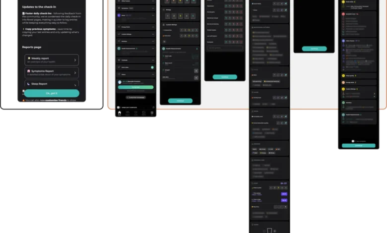
In the broader software industry, UI/UX trends are often driven by the need to capture fleeting user attention, signal brand innovation, and maximize engagement metrics. Designers frequently employ high-contrast neo-brutalism, complex gesture-based navigation, and elaborate animations to differentiate their products in crowded app stores. However, when these aesthetic choices are imported into the mental health sector, they often create significant friction.

A user opening a mental health app is rarely doing so out of curiosity or a desire for entertainment. They are frequently arriving in a state of cognitive overload, anxiety, or emotional exhaustion. In these states, the "delight" intended by a complex, trend-heavy interface is often perceived as an obstacle. For a person struggling with panic or depressive brain fog, an abstract, unlabeled icon or a non-standard swipe gesture is not a sophisticated design choice—it is a cognitive burden that can lead to immediate disengagement.

Analyzing the Retention Gap
The clinical implications of this design failure are profound. When an app—intended to be a tool for stability—unexpectedly forces a user to navigate a labyrinthine menu or disrupts their flow with aggressive upsell prompts, it violates the core mandate of therapeutic utility.

Research into mHealth (mobile health) engagement suggests that the most successful interventions are those that minimize the time-to-value. For example, a panic-support feature should be reachable in a single tap. If that path is obstructed by a "gamified" screen or a promotional banner, the app fails to act as a point of refuge. This observation is supported by comparative audits of successful apps, which demonstrate that users in a low-capacity state prioritize predictability over novelty. While gamification techniques like streaks and badges are effective for habit-forming in productivity or fitness apps, they can be counter-productive in mental health. If a user in a depressive episode misses a day, an aggressive notification or a "streak lost" alert can trigger feelings of failure, effectively alienating the user from the very tool they need for recovery.

The Five Pillars of Therapeutic Interface Design
To address these challenges, designers have begun to formalize an evaluation framework that assesses UI patterns against the specific needs of distressed users. This framework rests on five critical fronts:

- Cognitive Friction Reduction: Every interaction must be assessed for the mental energy it requires. If a design element—such as a hidden menu or an abstract animation—does not directly facilitate a therapeutic outcome, it should be reconsidered.
- Emotional Alignment: Visual language must match the user’s likely emotional state. While bright, high-energy palettes may suit fitness apps, they can be jarring for users experiencing trauma or burnout. Muted, grounded palettes often foster a sense of safety and professional trust.
- Navigational Consistency: Predictability is a therapeutic tool. By maintaining a stable information architecture, apps allow users to find support without having to relearn the interface during a crisis.
- Universal Accessibility: Trends like low-contrast text or gesture-only controls are not merely aesthetic; they are exclusionary. Given that the population using mental health apps frequently includes individuals with visual or motor impairments, accessibility must be a foundational constraint, not an afterthought.
- Non-Coercive Engagement: Return triggers must be respectful. Rather than using guilt-based notifications or coercive "streak" mechanics, developers are finding success with gentle, forgiving prompts that frame the app as a permanent, judgment-free support system.
Broader Industry Implications and Future Outlook
The shift toward "therapeutic usability" represents a significant evolution in digital product design. As the World Health Organization (WHO) reports that over one billion people globally are living with mental health conditions, the stakes for these applications have never been higher. The industry is moving away from the "move fast and break things" ethos toward a more clinically informed, evidence-based approach.

This change is also being driven by an increase in regulatory scrutiny. As digital health becomes a standardized component of primary care, regulators are beginning to demand that interfaces meet specific usability standards to ensure that support is not just available, but functional for the most vulnerable populations.

The successful apps of the future will likely be those that view their interface as a "quiet helper." This does not mean the design must be boring; it means the design must be invisible in its utility. By prioritizing the user’s emotional state, designers can transform apps from mere data-entry tools into digital sanctuaries.

A Framework for Implementation
For developers and design teams currently auditing their products, the path forward involves rigorous testing of every UI component. Before adopting a new design trend, teams should ask: "Does this element reduce the cost of usage when the user is at their most vulnerable?"

If a trendy glassmorphism effect or a new micro-interaction adds visual clutter that obscures the "start" button during a moment of crisis, it is failing the user. By contrast, if a design choice—such as a voice-input path or a high-contrast emergency button—simplifies the journey to relief, it serves the app’s ultimate purpose.

As the digital health sector continues to mature, the focus will increasingly shift from user acquisition to sustainable, long-term support. The designers who succeed will be those who recognize that while trends are fleeting, the need for a stable, predictable, and empathetic digital environment is permanent. In the context of mental health, the goal is not to impress the user with technical or artistic flair, but to ensure that when a user reaches out for help, the interface acts as a seamless conduit to the care they require.