Bridging the Gap: How UX Design Principles Are Transforming Data Visualisation from Passive Reporting to Strategic Decision-Making

Data visualisation sits at the critical intersection of two disciplines that have historically operated in silos: quantitative data analysis and human-centered design. Despite the ubiquity of business intelligence tools, a persistent problem plagues modern enterprises: dashboards that are technically accurate yet communicatively inert. While these platforms successfully aggregate millions of data points, they often fail to facilitate clear, actionable outcomes. In many corporate environments, weekly reviews and quarterly performance updates follow a recurring pattern—data is presented, stakeholders observe, and the session concludes without a decisive plan or clear strategic direction.
The root cause of this stagnation is rarely the quality of the data itself. Instead, it is a failure of intentional design. When dashboards are built by prioritizing available metrics rather than the specific questions they are intended to answer, they become archives rather than navigational tools. Meriem Benhabiles, a leading expert in the field, argues that by applying structured user experience (UX) thinking to data presentations, organizations can move beyond mere reporting and create functional interfaces that drive real-world changes.

The Evolution of Data Communication
The disconnect between data availability and data utility has widened as the barrier to entry for building dashboards has lowered. Tools such as Tableau, PowerBI, and Looker have democratized data access, yet they have also proliferated "dashboard clutter." This phenomenon often results in charts that look sophisticated but fail to convey a narrative.
Historically, the academic approach to this problem was anchored by statistician Francis Anscombe. In 1973, Anscombe demonstrated the "Quartet"—four distinct datasets that yielded identical statistical properties (mean, variance, and correlation) but revealed drastically different patterns when plotted visually. His work underscored a foundational truth: visualization is a diagnostic necessity, not an aesthetic luxury.
In the decades since, data experts like Edward Tufte have championed the "data-ink ratio," advocating for the removal of all decorative, non-data elements to maximize clarity. While Tufte’s principles remain vital for academic and exploratory research, they often fall short in high-pressure business environments. A dashboard is rarely read in isolation; it is viewed under time constraints by stakeholders with varying levels of data literacy. Consequently, the goal should not be simplicity for its own sake, but rather "appropriate complexity"—the exact level of detail required for a specific user to make a specific decision.

The 80% Rule: Upstream Architectural Choices
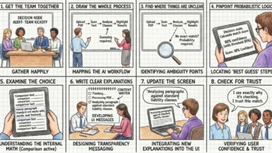
Effective data design begins long before a single chart is drawn. Industry best practices suggest that roughly 80% of a dashboard’s success is determined by the preliminary planning phase. This phase requires answering three fundamental questions:
- Context: What specific business question are we attempting to answer?
- Audience: Who is the end-user, and what is their level of data literacy and accountability?
- Insight: What specific organizational change or action is intended to follow the viewing of this data?
Most projects fail by working in reverse—starting with the available data and attempting to force-fit it into a visualization. A "context-first" approach, by contrast, restricts the data to only what is necessary to resolve a bottleneck. For instance, in an e-commerce funnel, rather than showing a high-density dashboard of every user interaction, a team should focus on a specific funnel chart that highlights exactly where the highest drop-off rate occurs. This specificity shifts the conversation from passive observation to operational intervention.
Audience Dynamics and Data Literacy
The effectiveness of a visualization is contingent on the viewer’s relationship with the data. A "Head of Sales" and a "Senior Data Analyst" require different interfaces for the same dataset. The analyst needs high-density, granular views to conduct discovery and diagnose root causes, whereas the executive requires a synthesized overview optimized for rapid budget and resource allocation.

Understanding this dynamic involves assessing "accountability." Data is rarely processed neutrally when an individual’s performance metrics are at stake. When a dashboard displays a decline in key performance indicators (KPIs), an executive’s reaction is often shaped by their level of responsibility for that metric. Designing for this reality involves adjusting the "density dial"—providing the executive with a high-level pulse check while ensuring the interface allows for a drill-down path to the granular data that the analyst needs.
Case Study: Enterprise Competency Tracking
A significant real-world application of this UX-led approach can be observed in the development of B2B SaaS platforms for enterprise talent management. When tasked with presenting large-scale telemetry data, designers often fall into the trap of building a "data graveyard."
In one notable project, the objective was to provide both individual contributors and managers with actionable insights into skill development. The design team bypassed standard, generic bar charts in favor of a radar chart. This choice was not an aesthetic preference but a functional requirement: a radar chart allows a user to identify a "skewed" competency profile at a single glance. If a user is proficient in cybersecurity but lacks skills in project management, the radial shape of the graph instantly highlights the gap, allowing for immediate corrective action—such as suggesting a specific training module.

The impact of this approach was measurable. Following the implementation of these UX-optimized, role-specific dashboards, client organizations reported a marked increase in weekly active engagement. Managers shifted from reactive, end-of-month reporting to proactive, weekly check-ins. By designing the "mental model" before the pixels, the platform transformed from a passive ledger of activity into a proactive management tool.
Implications for Future Data Strategy
The integration of UX into data strategy represents a fundamental shift in how organizations handle information. This shift has several broad implications for the industry:
- Reduction in "Fire Drills": By designing dashboards that clearly correlate metrics with outcomes, organizations can distinguish between genuine crises and noise. For example, a sharp drop in booking rates can be accurately attributed to a specific marketing campaign’s low-intent traffic rather than an assumed technical failure in the checkout flow.
- Enhanced Decision Velocity: When data is presented in a manner that aligns with the user’s cognitive flow, the time taken to reach a consensus in meetings is significantly reduced.
- Standardization of Language: A well-designed dashboard acts as a common language. By applying consistent color-coding, nomenclature, and layout patterns across an organization, stakeholders can interpret data across different functions with minimal friction.
Conclusion: From Passive Logs to Strategic Engines
The transition from a passive data repository to an active decision-making engine is the next frontier for business intelligence. Organizations that treat visualization as an upstream architectural choice—prioritizing the "why" and "who" over the "what"—will inevitably outperform those that continue to prioritize data density.

As data continues to permeate every function of the modern enterprise, the role of the designer is becoming as critical as that of the data scientist. The future of data communication lies in recognizing that every chart carries a hidden imperative for action. If a dashboard does not trigger a decision, a shift in understanding, or a change in direction, it has failed its primary purpose. By adopting a human-centered approach, organizations can finally ensure that their data does not just describe the past, but effectively shapes the future.