The Era of Tabular Foundation Models: A New Frontier in Data Prediction and Analysis

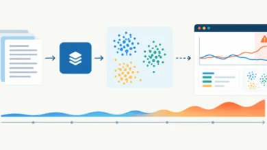
A significant paradigm shift is underway in the field of tabular data prediction, as a new class of models, dubbed "tabular foundation models," is consistently outperforming the long-reigning champions: gradient-boosted decision trees (GBDTs). These innovative models leverage transformer architectures, akin to those powering large language models (LLMs), to predict missing columns in any table with zero-shot capability, fundamentally altering how data scientists approach structured data challenges. Recent rigorous audits and benchmark analyses, notably on the community-driven TabArena leaderboard, reveal that every single-model entry surpassing the best-tuned GBDT configurations is now one of these tabular foundation models. This development signals a profound re-evaluation of established best practices in data science, moving towards more generalized, pre-trained solutions for tabular data.
A Decades-Long Reign Challenged: The Evolution of Tabular Data Modeling
For over a decade, gradient-boosted decision trees, encompassing popular algorithms like XGBoost, LightGBM, and CatBoost, have been the undisputed workhorses for predictive modeling on structured, tabular datasets. Their strength lies in their ensemble nature, sequentially building numerous weak decision trees and combining their predictions to achieve high accuracy. GBDTs are renowned for their interpretability, robustness to various data types, and strong performance across a wide array of classification and regression tasks. Data scientists have spent countless hours on meticulous feature engineering, hyperparameter tuning, and ensemble stacking to extract the maximum performance from these models. The typical workflow involved extensive data preparation, followed by a computationally intensive "training" phase where the GBDT learned patterns specific to a given dataset. This established methodology, while effective, often demanded significant human effort and computational resources for optimization.
The advent of foundation models, particularly Large Language Models (LLMs) in natural language processing (NLP) and vision transformers in computer vision, has revolutionized their respective domains by introducing the concept of massive pre-training on vast datasets, leading to models capable of zero-shot or few-shot learning on new, unseen tasks. The question naturally arose: could a similar paradigm apply to tabular data, which, despite its ubiquity, has historically resisted generalized, pre-trained approaches due to its inherent structural heterogeneity?
The Emergence of Tabular Foundation Models: A Chronological Breakthrough

The conceptual groundwork for tabular foundation models began to solidify with pioneering works like TabPFN (Tabular Prior-data Fitted Network). TabPFN introduced the idea of "in-context learning" for tabular data, where a model, pre-trained on a vast distribution of synthetic tables, could make predictions on a new table by simply being shown a few labeled examples within the input context, without any gradient-based training on the new data. This represented a radical departure from traditional methods, where every new dataset required a fresh training cycle.
Following TabPFN, the field rapidly evolved. Researchers at Inria’s SODA team developed TabICL and its successor, TabICLv2, aiming for improved performance, reproducibility, and open access. Layer 6 introduced TabDPT, further exploring transformer architectures for tabular data. Most recently, Google Research unveiled TabFM, quickly ascending to the top of benchmarks, albeit with less transparency regarding its internal workings and licensing. This rapid succession of innovations highlights an accelerating pace of research and development in this specialized domain, signaling a broader industry interest in finding more scalable and automated solutions for tabular data.
These tabular foundation models differ fundamentally from text LLMs in their core mechanisms. While both utilize transformer architectures, the "token" in a tabular model is not a word-piece but rather individual cells, columns, and rows—a collection of numbers and categories without a fixed vocabulary. Their pre-training doesn’t involve internet text but rather millions of small, synthetic tables generated by random structural causal models (SCMs). This synthetic data generation process instills a general procedure for inferring relationships between features and targets, rather than world knowledge. Consequently, tabular FMs are significantly smaller than text LLMs; TabICLv2, for instance, operates effectively with approximately 28 million parameters, a fraction of the billions typically found in state-of-the-art text LLMs. Another key distinction lies in data order: text LLMs inherently rely on sequence, while tabular models must be invariant to row shuffling, necessitating specialized architectures to handle unordered sets of data points.
TabICLv2: Small, Open, and Independently Verified
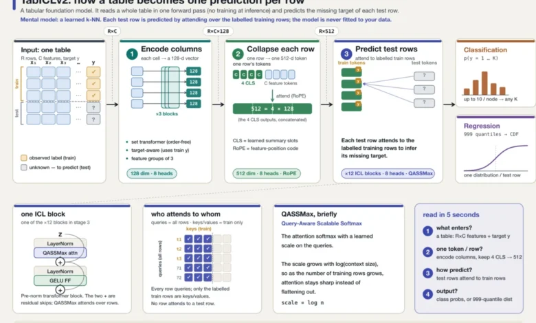
Among the leading tabular foundation models, TabICLv2 stands out for its combination of robust performance, compact size, and unrestricted open-source availability. Its architecture is a sophisticated three-stage transformer pipeline designed for efficient in-context learning:
- Column Embedding Transformer: This initial stage processes each column independently, transforming raw numerical or categorical values into context-aware embeddings. It learns the distribution of values within each feature, ensuring that, for example, the number "450" is understood differently in a "price" column than in a "postcode" column.
- Row Vector Transformer: After individual cells are embedded, this stage collapses each row into a single fixed-length vector. It employs learned query tokens (similar to [CLS] tokens in NLP) that attend over the per-feature embeddings, summarizing the essential information of each row.
- In-Context Learning Transformer: This final stage performs the prediction. Without any gradient descent, test-row vectors attend over labeled train-row vectors, essentially performing a learned k-nearest-neighbors operation. The model infers labels by weighing the similarity of test rows to known examples, demonstrating its zero-shot capability.
TabICLv2 further incorporates specialized heads for different tasks: a hierarchical classifier for multi-class problems and a regression head that outputs 999 quantiles. This quantile output, trained using pinball loss, provides a full predictive distribution, offering not just a point estimate but also an honest interval of uncertainty—a significant advantage for decision-making under uncertainty.

The independent audit of TabICLv2 on the TabArena benchmark underscored its reliability. The author re-ran the model from scratch on controlled hardware (an AWS A10G GPU), covering 51 datasets under the benchmark’s Lite protocol. The results, an Elo score of 1559 versus the official 1575, fell well within the expected bootstrap intervals, confirming the model’s reported performance with remarkable accuracy. This verification, achieved for a mere $2 in GPU costs over a 2.1-hour session, strongly validates TabICLv2’s claims of reproducibility and efficiency.
The TabArena Benchmark: A New Standard for Tabular AI Evaluation
The TabArena leaderboard serves as the critical battleground for evaluating tabular models. It comprises 51 diverse datasets, ranging from 748 to 150,000 rows and 5 to 1,777 features, encompassing binary classification, multi-class classification, and regression tasks. Models are assessed using task-appropriate metrics like ROC-AUC, log-loss, and RMSE, aggregated into an Elo rating system—a scale anchored with a default RandomForest at 1000, where a 400-point gap signifies 10:1 win odds. This dynamic, continuously updated benchmark provides a robust and objective measure of model performance.
The independent recomputation of the TabArena Elo scores, matching 67 out of 69 methods within ±1 Elo, further solidifies the benchmark’s integrity. This meticulous validation of the scoring pipeline ensures that the observed shifts in model dominance are not artifacts of the evaluation system but genuine reflections of performance improvements.
Dominance Confirmed: Tabular Foundation Models Outperform GBDTs
The latest snapshot of the TabArena leaderboard (July 15, 2026) unequivocally demonstrates the ascendance of tabular foundation models. Every single-model entry above the best-tuned and ensembled GBDT configuration is a tabular foundation model. LightGBM, even with extensive tuning and post-hoc ensembling, achieves an Elo of 1432. In stark contrast, TabICLv2, requiring no tuning whatsoever, sits 158 Elo points above it. Other FMs, including the gated TabPFN line and the top-ranked TabFM, achieve even higher scores.

This performance margin is substantial and challenges the long-held belief in the supremacy of GBDTs for tabular data. While GBDTs, particularly CatBoost, still offer highly efficient solutions on CPUs, the foundation models provide a compelling combination of accuracy and "fitting" speed (which is essentially inference for these models). TabICLv2’s median prediction time of 0.38 seconds per 1,000 rows is significantly faster than tuned-and-ensembled LightGBM (2.64 seconds), and its median "fit" time of 4 seconds per 1,000 rows is roughly a hundred times shorter than typical GBDT tuning protocols. This efficiency, particularly the rapid deployment due to the absence of hyperparameter search, presents a strong business case for adopting these new models.
However, the current leader, TabFM, developed by Google Research, presents a nuanced situation. While it tops the board with an impressive 98 Elo lead over the next single model, it lacks a published technical paper, and its weights are released under a non-commercial license. This opacity, though common in rapidly evolving AI research, raises questions about its internal mechanisms and long-term viability for widespread commercial adoption, underscoring the value of open and transparent models like TabICLv2.
The Limits of Language: Native Tabular Models vs. Text LLMs
A critical distinction is often blurred by the informal term "tabular LLMs." While tabular foundation models use transformer architectures, they are fundamentally different from text-based LLMs prompted with serialized tabular data. To quantify this, a test was conducted using Claude Opus 4.8, a frontier text LLM, on the TabArena datasets. The LLM was given tables serialized as text, along with 64 labeled example rows and batches of test rows for prediction.
The results were largely one-sided. On 49 scorable datasets, the text LLM beat TabICLv2 on only 6, exhibiting a median error 57% higher than the table-native model. It performed marginally better on datasets where column names carried significant real-world semantic meaning (e.g., churn, credit, blood-donation tables), which an LLM could leverage. Conversely, it performed poorly on datasets dominated by pure patterns (e.g., app-permission vectors, sensor data), where linguistic priors offer no advantage. This highlights that while text LLMs are powerful, they are not inherently optimized for the unique structure and patterns of tabular data, reinforcing the necessity of models purpose-built for this domain. The cost differential is also stark: the prompted LLM cost approximately $1.50 per thousand predictions, compared to fractions of a GPU-second for the 28M-parameter table-native model.
Where GBDTs Still Excel: A Regime-Specific Analysis

Despite the overall dominance of tabular foundation models, a detailed regime analysis reveals specific scenarios where GBDTs remain the preferred choice. While TabICLv2 wins on 40 of 51 datasets against the best-tuned GBDTs, the 11 losses cluster in two critical areas:
- High Dimensionality: For datasets with more than 100 features, GBDTs consistently outperform foundation models. Examples include Bioresponse (1,776 features), hiva_agnostic (1,617), QSAR-TID-11 (1,024), kddcup09 (212), and MIC (111). Tabular foundation models, particularly those relying heavily on attention mechanisms, can struggle with the combinatorial complexity and increased noise of very wide tables.
- Scale with High-Cardinality Categoricals: GBDTs also retain an edge on very large datasets (e.g., above 20,000 rows) combined with numerous high-cardinality categorical features. The Amazon employee access dataset, a classic example of this shape, saw a 25% error gap in favor of GBDTs.
This regime split suggests that while tabular FMs offer a general, high-performing solution for a broad range of typical business datasets, specialized challenges still benefit from the optimized inductive biases of GBDTs. Data scientists are advised to consider the dimensionality and nature of categorical features when selecting their primary modeling approach.
The Purity Debate: Data Contamination and Trust
A persistent concern in the development of foundation models is data contamination, where benchmark datasets inadvertently leak into the pre-training corpus, leading to artificially inflated performance. This issue was a central theme in time-series model audits and is equally relevant for tabular models.
TabICLv2 and the original TabPFN models maintain impeccable data provenance by being pre-trained exclusively on synthetic data generated from random structural causal models. This "by construction" approach rigorously rules out any possibility of benchmark contamination, ensuring that their reported performance is a true reflection of their generalization capabilities.
However, subsequent models have pursued performance gains by incorporating real-world data into their pre-training. RealTabPFN-2.5, for instance, augments its synthetic pre-training with a "curated corpus of 43 real-world tabular datasets" from OpenML and Kaggle. While its developers describe rigorous deduplication pipelines, the process of verifying such claims externally remains challenging. TabDPT goes even further, pre-training on 123 OpenML datasets, raising specific concerns given that TabArena itself draws datasets from OpenML. This practice, while potentially yielding higher Elo scores, introduces an element of trust in the developers’ deduplication efforts. Researchers and industry experts consistently emphasize that for AI systems to be truly trustworthy and reliable, especially in critical applications, the transparency of their pre-training data and methodologies is paramount. Without open access to pre-training data or independent verification, performance gains derived from real-world data must be interpreted with caution.

Hybrid Futures: Combining Models for Peak Performance
The complementary strengths of different model types suggest a future where hybrid approaches, leveraging model ensembles or routing strategies, achieve superior performance. Analysis of TabArena’s per-split validation and test errors allowed for simulating such hybrid strategies.
An "oracle router," which always picks the best model per dataset (a theoretical ceiling), demonstrated significant headroom. An oracle combining TabICLv2 and tuned LightGBM achieved an Elo of 1674, a +103 gain over TabICLv2 alone, even though LightGBM typically sits 160 Elo points below it. This highlights that even models with lower overall performance can offer crucial gains on specific subsets of data. Combining two foundation models (FM+FM oracle) achieved an even higher 1707 Elo, surpassing nearly all entries on the board.
Crucially, a deployable router, which makes decisions based solely on validation error (information available at deployment time), proved effective when combining foundation models. Routing between TabICLv2 and TabPFN-2.6 yielded an Elo of 1645, outperforming both individual models and recovering roughly half of the oracle’s potential gains. This demonstrates a practical path to immediate performance improvements by intelligently combining existing foundation models.
However, the same validation-based router failed when attempting to combine a foundation model with a GBDT. Val-picking between TabICLv2 and tuned LightGBM resulted in an Elo of 1534, which was lower than simply always using TabICLv2. This suggests that the validation errors generated by different model families might not be directly comparable, potentially due to variations in internal validation estimates (e.g., GBDTs’ bagged internal validation appearing overly optimistic compared to FMs’). This finding implies that extracting the benefits of GBDT complementarity will require more sophisticated selection signals than raw validation error alone.
Implications for the Future of Data Science

The emergence and verified performance of tabular foundation models mark a pivotal moment for data science. For practitioners, this signifies a powerful new tool that can significantly reduce the time and effort traditionally spent on hyperparameter tuning and model training. The ability to achieve state-of-the-art accuracy with zero-shot inference means faster iteration cycles and quicker deployment of predictive models. Businesses can expect more agile data pipelines and potentially higher accuracy in their analytical endeavors, although they must also consider the shift from CPU-centric GBDTs to GPU-accelerated foundation models.
For the research community, this development opens new avenues for exploring generalized learning on structured data, advancing synthetic data generation techniques, and potentially integrating tabular models into broader multimodal AI systems. The ongoing debate around data provenance and transparency also underscores the critical need for robust auditing mechanisms and open-science practices to ensure the trustworthiness and ethical deployment of these powerful new technologies.
While the landscape is still evolving, the evidence is clear: tabular foundation models are not just a fleeting trend but a fundamental advancement, reshaping the best practices for predictive analytics on structured data. The challenge now lies in understanding their full capabilities, defining their optimal use cases, and ensuring their development aligns with principles of transparency and reproducibility.