Textual, a powerful Python library, is revolutionizing the way developers create graphical user interfaces (GUIs) directly within the command-line interface (CLI). This innovative framework empowers users to build sophisticated, interactive terminal applications that mimic the functionality and visual appeal of traditional desktop applications. Among the diverse array of widgets available in Textual, the humble checkbox plays a crucial role in managing Boolean (true/false) choices, offering a clear visual indicator for option states. This article delves into the practical application and customization of the Textual checkbox widget, providing developers with the knowledge to integrate and refine this essential component within their terminal-based applications.
Understanding the Fundamental Checkbox Widget in Textual
The checkbox widget in Textual is designed to represent a binary choice. When checked, it signifies a "true" state, and when unchecked, it indicates a "false" state. This straightforward functionality makes it an indispensable tool for presenting users with options that can be independently enabled or disabled, such as selecting preferences, toggling features, or confirming agreements.
To begin exploring the basic functionality of the Textual checkbox, a fundamental code structure is employed. Developers can initiate this by creating a new Python file within their preferred Integrated Development Environment (IDE) and implementing the following code snippet:
from textual.app import App, ComposeResult
from textual.containers import VerticalScroll
from textual.widgets import Checkbox
class CheckboxApp(App[None]):
def compose(self) -> ComposeResult:
with VerticalScroll():
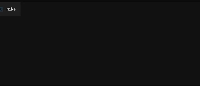
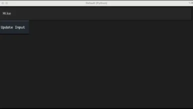
yield Checkbox("Mike")
def on_checkbox_changed(self, event: Checkbox.Changed) -> None:
self.notify(f"Checkbox value: event.value")
if __name__ == "__main__":
CheckboxApp().run()This foundational example, inspired by the comprehensive documentation provided by Textual, demonstrates the core principles of integrating a checkbox. While the VerticalScroll container is utilized for convenience, particularly when managing multiple widgets, its inclusion is not strictly mandatory for the checkbox itself to function. The primary focus remains on the Checkbox widget.
The compose() method within the CheckboxApp class is responsible for yielding the Checkbox widget. Following its instantiation, the application is configured to capture the Checkbox.Changed event. This event is triggered whenever the state of the checkbox is altered by the user. Upon detection of this event, the application displays a notification to the user, clearly indicating the new value of the checkbox, whether it has been checked (resulting in True) or unchecked (resulting in False).
Upon execution of this code, users will observe a basic checkbox displayed within their terminal. The default appearance of the checkbox, when unchecked, typically presents as a greyed-out "X." This visual representation, while functional, may not always align with the desired aesthetic or contrast requirements of all terminal environments, especially those with dark backgrounds. This leads to the exploration of customizing the checkbox’s appearance.
Customizing the Checkbox Widget for Enhanced Aesthetics and Functionality
The default appearance of an unchecked checkbox in Textual, characterized by a greyed-out "X," can sometimes present contrast challenges on darker terminal backgrounds. Many graphical user interface toolkits traditionally render unchecked checkboxes as entirely empty boxes. Textual offers developers the flexibility to modify this behavior, allowing for greater control over the widget’s visual presentation.
Achieving a custom checkbox appearance in Textual typically involves subclassing the existing Checkbox widget. This approach allows developers to inherit the base functionality while overriding specific attributes and methods to achieve the desired modifications.
Consider the following Python code, which illustrates the creation of a custom checkbox:
from textual.app import App, ComposeResult
from textual.containers import VerticalScroll
from textual.widgets import Checkbox

class CustomCheck(Checkbox):
    BUTTON_INNER = " "  # Default to an empty space for unchecked state

    def toggle(self) -> None:
        # Dynamically change the BUTTON_INNER based on the new value
        if self.value:
            CustomCheck.BUTTON_INNER = "X"  # Show 'X' when checked
        else:
            CustomCheck.BUTTON_INNER = " "  # Show empty space when unchecked
        self.value = not self.value  # Toggle the actual value
        return self

class CheckboxApp(App[None]):
    # CSS_PATH = "checkbox.tcss"  # Uncomment to enable CSS styling

    def compose(self) -> ComposeResult:
        check = CustomCheck("Mike")  # Instantiate the custom checkbox

        with VerticalScroll():
            yield check

    def on_checkbox_changed(self, event: Checkbox.Changed) -> None:
        self.notify(f"Checkbox value: event.value")

if __name__ == "__main__":
    CheckboxApp().run()
In this enhanced example, a new class, CustomCheck, is created by inheriting from Checkbox. The primary customization occurs through the overriding of two key elements:
-
BUTTON_INNERClass Attribute: This attribute dictates the character displayed within the checkbox when it is in its unchecked state. By default, it is set to an empty string (" "), meaning an unchecked box will appear as a blank space. -
toggle()Method: This method is invoked whenever the checkbox’s state is flipped. The overriddentoggle()method intelligently updates theBUTTON_INNERattribute. If the checkbox is being checked (transitioning toTrue),BUTTON_INNERis set to"X". Conversely, if it is being unchecked (transitioning toFalse),BUTTON_INNERis reset to" ". This dynamic adjustment ensures the correct visual representation corresponds to the checkbox’s actual state. The method also explicitly toggles the internalself.valueattribute.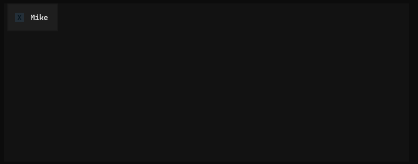
To utilize this custom widget, the compose() method is modified to instantiate CustomCheck instead of the default Checkbox. The rest of the application’s logic for handling state changes remains the same, benefiting from the enhanced visual presentation of the custom checkbox.
Further Enhancements with Textual CSS
Beyond programmatic customization, Textual offers a powerful styling system akin to CSS, allowing for sophisticated visual refinement of widgets. To further enhance the visibility and aesthetic appeal of the CustomCheck widget, borders can be applied using Textual’s styling capabilities.
This is achieved by creating a separate CSS file, typically named checkbox.tcss (or any other descriptive name), and placing it in the same directory as the Python script. The CSS file would contain the following rules:
CustomCheck
    border: round green;
This CSS rule targets all instances of the CustomCheck widget and applies a round border style with the color green. To integrate this stylesheet into the Textual application, the CSS_PATH class attribute within the CheckboxApp class needs to be uncommented and set to the name of the CSS file:
class CheckboxApp(App[None]):
    CSS_PATH = "checkbox.tcss"  # Link the CSS file

    # ... rest of the compose method and event handlers
Upon running the application with the linked CSS file, users will observe the CustomCheck widget enclosed within a prominent green border, significantly improving its visual distinction and integration within the terminal interface. This combination of programmatic customization and CSS styling provides a high degree of control over the appearance and behavior of Textual widgets.
The Implication of Enhanced UI Elements in Terminal Applications
The ability to create visually appealing and functionally rich user interfaces within the terminal has profound implications for various domains. For developers, it means the creation of more intuitive and user-friendly command-line tools. This can lead to:
- Improved User Experience: Applications that are easier to navigate and interact with can reduce the learning curve for new users and increase efficiency for experienced ones.
- Enhanced Data Visualization: Complex data can be presented in a more digestible format, making it easier for users to understand trends and patterns.
- Streamlined Workflows: Interactive elements like custom checkboxes can simplify complex configuration processes or data entry tasks, automating repetitive actions.
- Cross-Platform Consistency: Textual aims to provide a consistent look and feel across different operating systems, reducing the need for platform-specific UI development.
The customization of widgets like the checkbox directly contributes to these broader goals. By allowing developers to fine-tune visual elements, Textual empowers them to create terminal applications that are not only functional but also aesthetically pleasing and tailored to specific user needs or branding guidelines.
The underlying mechanism for this customization often involves understanding the internal structure of Textual widgets. Developers are encouraged to examine the source code of existing widgets to identify modifiable attributes and methods. This investigative approach, coupled with iterative development, is key to achieving highly personalized widget behaviors and appearances.
Beyond the Checkbox: A Gateway to Advanced Textual Development
The journey into customizing Textual widgets extends far beyond the checkbox. The principles demonstrated—subclassing, attribute overriding, and method modification—are applicable to virtually any widget within the Textual framework. This includes, but is not limited to, buttons, input fields, scrollable areas, and even complex layout containers.
For instance, customizing a button might involve changing its click behavior, altering its visual state on hover, or introducing custom animations. Modifying an input field could entail implementing custom validation logic, defining specific input masks, or changing the appearance of the cursor.
The Textual documentation serves as an invaluable resource in this regard. By studying the API and exploring examples, developers can gain a deeper understanding of the available widgets and the methods by which they can be extended and customized. The community forums and developer channels also offer a collaborative environment for seeking advice and sharing knowledge.
The continuous evolution of the Textual library, with regular updates and new features, further encourages experimentation and innovation. Developers who invest time in mastering Textual’s customization capabilities will be well-positioned to build cutting-edge terminal applications that stand out in terms of both functionality and user experience. The commitment to exploring and adapting these powerful tools is a testament to the growing sophistication of terminal-based software development.


