The digital interface serves as the primary gateway for user interaction, yet fundamental elements such as accordion menus often suffer from design ambiguity that hampers usability. Recent empirical research, particularly from the Nielsen Norman Group (NN/g), has provided a data-driven look at how icon choice dictates user behavior in mobile and desktop environments. The findings suggest that the industry has long overcomplicated what should be a straightforward interaction, leading to friction in user journeys and unnecessary cognitive load.
The Evolution of Accordion Design and User Expectations
Accordions, a staple of web design, are UI patterns that allow users to toggle the visibility of content. While the concept is simple—expand to show, collapse to hide—the visual signals used to trigger these states have historically been inconsistent. Over the past decade, designers have experimented with a variety of symbols, including plus signs, chevrons, arrows, and custom geometric shapes, often without considering the mental model of the end user.
Historically, the lack of standardization in UI kits led to a fragmentation of design language. Early web design favored simple text links, but as mobile-first design became the industry standard, the need for space-saving navigation patterns grew. This shift birthed the widespread adoption of the "hamburger" menu and the vertical accordion, yet the industry failed to reach a consensus on which icon best signifies a hidden menu versus a direct navigational link.
Analyzing the Impact of Iconography on User Behavior
The core of the issue lies in what the user expects to happen upon clicking a specific element. NN/g’s comprehensive study on this subject indicates that users possess deeply ingrained expectations regarding navigational markers. When a user encounters a text label without an accompanying icon, they almost universally expect the link to navigate them to a new page. The introduction of an icon changes this expectation, but not always in a predictable way.
Data from recent usability tests reveal a striking trend: when symbols like arrows (which often imply directionality or movement) are used to represent an accordion, users are frequently confused. Arrows are cognitively associated with "forward" progress or scrolling. When an arrow points to a list that then expands downward, the visual language becomes contradictory. Furthermore, the use of "plus" icons introduces another layer of ambiguity. A plus sign can signify "add to cart," "save for later," or "zoom in," making it a poor choice for content expansion in complex multi-level menus.

The Dangers of the Split Menu Pattern
Perhaps the most significant finding in modern interface research is the failure of the "split menu" pattern. A split menu is a design configuration where a single UI element serves two functions: clicking the text label navigates the user to a parent category page, while clicking the icon expands the submenu.
This design is increasingly viewed as a major usability hazard. In practice, users do not differentiate between the "hit area" of the text and the "hit area" of the icon. Because the targets are often adjacent or overlapping, users frequently trigger the wrong action. If a user intends to see the sub-items but is redirected to a landing page, the friction of the back-button cycle ensues. This creates a negative feedback loop, causing frustration and increasing the bounce rate of the site. Professionals now argue that if a category requires a landing page, that page should be the first item within the expanded menu, rather than an independent link that competes with the accordion’s primary function.
The Case for the Caret as the Industry Standard
In the search for a universal standard, the caret (a simple triangle, usually pointing down) has emerged as the most reliable indicator for accordion behavior. Unlike arrows, which imply movement, or plus signs, which imply arithmetic or addition, the caret is a static, non-directional symbol that has become synonymous with "disclosure" or "dropdown."
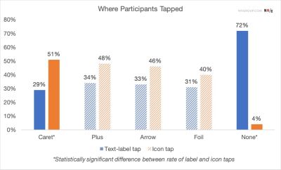
Analysis of user performance confirms that when a caret is used, users are more likely to correctly predict that the content will expand in place. This reduces the time-to-task and improves overall site accessibility. The recommendation from UX researchers is clear: use a downward-pointing caret to represent a collapsed state and rotate it to an upward-pointing or sideways-pointing position to signify an expanded state. This visual feedback loop is immediate and requires minimal cognitive processing from the user.
Strategic Implications for Web Development
The movement toward simplifying interface elements reflects a broader trend in web development: the prioritization of "invisible design." As users become more tech-savvy, they have less patience for visual clutter. The "less is more" approach is not merely an aesthetic preference but a functional necessity.
For developers and designers, the implications are three-fold:

- Uniformity: Adopting the caret as the standard icon for accordions across a product’s ecosystem ensures that users learn the interface once and can apply that knowledge globally.
- Elimination of Redundancy: Designers should remove unnecessary icons. If a text element is a standard link, an underline is sufficient. Adding an arrow or chevron next to a link that simply changes the URL creates "noise" that interferes with the user’s ability to parse the menu hierarchy.
- Consistency in Interaction: Ensuring that the entire menu row is a single, consistent click target eliminates the issues associated with split buttons. If the goal is navigation, the design should facilitate that path without ambiguity.
Supporting Data and Real-World Applications
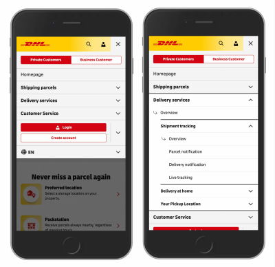
Real-world application of these principles can be seen in the navigation structures of major logistics and information platforms. Companies like DHL have moved toward cleaner, more logical menu structures that avoid "split-button" confusion. By treating the menu item as a container for the sub-options and including "Overview" pages within those lists, these platforms provide a more predictable experience.
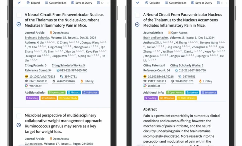
Furthermore, academic and search-based platforms, such as Lens.org, have successfully implemented the caret-based disclosure pattern. In their search result interfaces, where users must manage large volumes of data, the use of the caret to expand and collapse abstracts allows for a clean, efficient view that keeps the user within the context of the search page.
The Broader Impact on Digital Accessibility
Beyond basic usability, these findings have profound implications for accessibility. Users with cognitive impairments or those who rely on screen readers benefit immensely from clear, predictable, and standard interaction patterns. When icons are used inconsistently—or worse, when they are overloaded with multiple meanings—it creates a significant barrier for users who rely on consistent visual cues to navigate the web.
The shift toward standardized, clear navigation is a hallmark of a maturing web. By moving away from "clever" or "custom" icons and toward established patterns, the design community can significantly improve the inclusivity of the internet.
Conclusion
The data consistently demonstrates that the most effective interfaces are those that respect the user’s mental models. While the temptation to innovate with unique icons and complex split-menu layouts is strong, the evidence suggests that simplicity is the most reliable strategy for user retention and satisfaction. By sticking to the caret for accordions and relying on standard text formatting for links, designers can create interfaces that are not only more professional but also more intuitive. As the digital landscape continues to grow in complexity, the ability to simplify navigation will remain one of the most critical skills for those building the next generation of web experiences. Moving forward, the focus must remain on the user’s intent, ensuring that every element on the screen serves a clear, singular purpose without ambiguity.