Despite broad browser support, CSS container queries remain a significantly underutilized feature in modern web development, often misunderstood as a direct replacement for media queries rather than a distinct tool for component-based architecture. While media queries have served as the bedrock of responsive design for nearly two decades, their reliance on the browser viewport as the sole source of truth for layout logic has become a limitation in an era of highly modular, reusable web components.
The Evolution of Responsive Design
The history of web responsiveness is defined by the shift from fixed-width layouts to fluid, device-aware interfaces. In 2010, Ethan Marcotte’s seminal article on responsive web design introduced the industry to the concept of fluid grids, flexible images, and media queries. At the time, this was a revolutionary approach to the growing fragmentation of mobile and desktop screen sizes.
However, as web applications evolved from static pages to complex, component-driven systems, the limitations of the viewport-centric model became apparent. A developer might design a “card” component intended for a three-column grid. On a large desktop screen, the card looks correct; however, when that same component is placed inside a narrow sidebar, the media query, which only recognizes the global viewport width, fails to trigger a layout shift. The card becomes cramped, text overflows, and visual hierarchy collapses. This architectural friction has persisted for years, with "container queries" appearing on virtually every major CSS wishlist since 2019.

Current State of Adoption
The disconnect between the availability of container queries and their implementation is striking. According to the 2025 State of CSS survey, while 86% of developers report awareness of the feature, only 41.4% have integrated them into their workflows. This adoption gap is particularly notable given that the feature currently enjoys roughly 94% browser support, effectively eliminating the compatibility hurdles that often stall new web standards.
Industry experts, including educator and developer Kevin Powell, have highlighted this stagnation at major industry conferences, noting that the reluctance to adopt the technology often stems from a fundamental misconception: developers treat container queries as a "viewport query" for specific elements. Because the syntax—@container versus @media—appears similar, many practitioners fail to realize that these features serve entirely different architectural purposes.
Conceptualizing Macro versus Micro Layouts
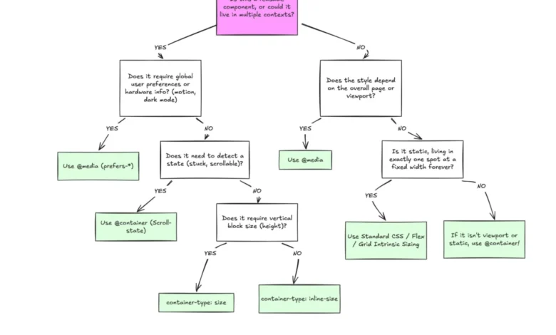
To understand the necessity of container queries, one must distinguish between "macro" and "micro" layouts. Macro layouts concern the overall structure of a page—the primary navigation, the main content grid, and the footer. These elements are fundamentally tied to the browser window, making media queries the appropriate tool for their responsive behavior.
Conversely, micro layouts refer to the internal components—the cards, widgets, and form groups that live within those larger containers. These elements should be "context-aware." A component should be able to query the space immediately available to it, rather than the width of the user’s monitor. By shifting the logic from the viewport to the container, developers can create components that are truly portable, functioning identically whether they are placed in a full-width hero section or a narrow side panel.

Technical Implementation and Fluidity
The transition to container-based logic also facilitates advanced responsive techniques like fluid typography. Historically, developers used viewport units (vw, vh) to scale text, a practice that often led to inconsistent results when components were moved across different page contexts. By leveraging container query units—such as cqi (container query inline-size)—designers can now define typography that scales in direct proportion to the specific container, ensuring visual harmony regardless of the component’s parent environment.
Furthermore, container queries solve long-standing challenges regarding layout state detection. For instance, determining when a flexbox container has wrapped its items onto a new line has historically required JavaScript-heavy solutions using ResizeObserver. By using container queries, developers can now trigger CSS transitions based on the width of the parent container, effectively "seeing" the internal layout shift without the performance overhead of external scripts.
Addressing Implementation Risks and Caveats
Despite their utility, container queries require a fundamental shift in how developers structure their DOM. A common pitfall is the attempt to have a component query its own size, which creates a circular dependency and prevents the layout from rendering correctly. Developers must ensure there is a clear parent-child relationship: the parent element acts as the defined container, while the child elements react to the container’s dimensions.
Additionally, querying the "block-size" (vertical height) of a container can lead to layout collapse if not managed with explicit sizing, such as min-height or aspect-ratio, because the browser calculates the container’s dimensions independently of its internal content. Another limitation is the inability to use CSS custom properties directly within a query condition. Because custom properties rely on the cascade, allowing them within a query could create infinite loops or unpredictable state changes, a safeguard currently enforced by the CSS specification.

Broader Implications for Web Architecture
The move toward container-based responsive design represents a shift toward a more modular, component-first web. By decoupling component styling from global viewport logic, teams can build design systems that are significantly more resilient to changes in page structure. This reduction in "global" styling dependencies helps mitigate the common issue where a layout change in one part of an application inadvertently breaks unrelated components elsewhere.
While media queries remain an essential part of the developer’s toolkit, their role is increasingly relegated to global page-level adjustments. As the web continues to fragment into thousands of unique viewport sizes—with over 2,300 variations recorded in recent testing—relying on the viewport as a proxy for design logic is becoming less sustainable.
The industry is reaching a point where "responsive" must mean more than just "screen-size aware." It must mean "content-aware." By embracing container queries, the development community has the opportunity to move past the rigid constraints of early responsive design, creating interfaces that are inherently more flexible, maintainable, and robust. The technology is stable, the support is present, and the architectural benefits are documented; the final barrier to adoption remains the professional habit of viewing the browser as the only frame of reference for the modern web.