
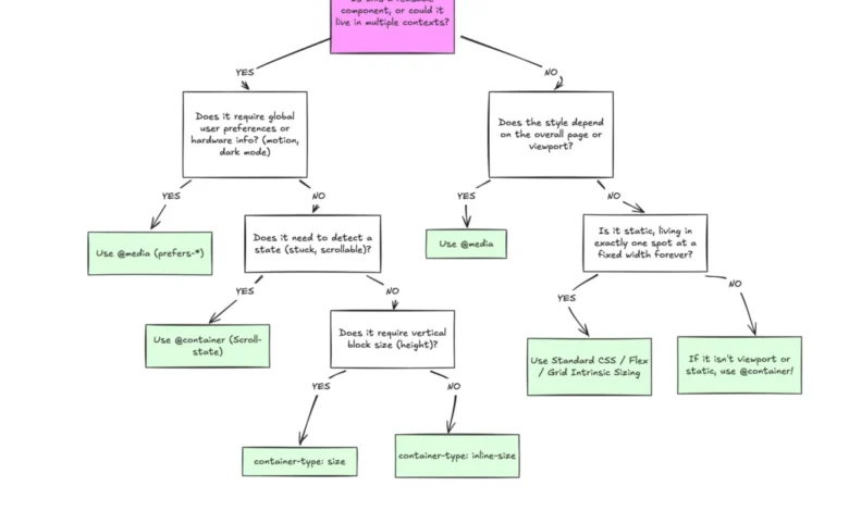
Despite broad browser support, container queries remain one of the most underutilized and frequently misunderstood advancements in modern front-end development. Although the feature has achieved approximately 94% global browser compatibility, the transition from legacy viewport-based responsive design to component-aware architecture has been surprisingly slow. According to the 2025 State of CSS survey, while 86% of developers express awareness of container queries, only 41.4% have integrated them into their production workflows. This disparity between technical availability and industry adoption highlights a critical shift in how developers must conceptualize layout logic in an era of highly reusable, modular web components.
The Evolution of Responsive Design
To understand why container queries are a paradigm shift, one must consider the historical context of responsive web design. Since the introduction of the @media rule, developers have relied on the viewport as the primary proxy for design adaptation. This approach, pioneered during the early mobile-web revolution, allowed developers to create "macro" layouts that responded to the overall screen width. However, this method carries an inherent limitation: the CSS rules are dictated by the browser window, not the element itself.
In a modern component-driven architecture, a UI element—such as a product card or a navigation widget—is often recycled across different areas of an application. A card designed for a full-width feed may be placed in a narrow sidebar or a restricted modal. When using traditional media queries, the card remains oblivious to its actual space, leading to layout deformations, overflow errors, or cramped typography. The industry has reached a point of fragmentation where over 2,300 unique viewport sizes exist across devices; attempting to account for these via standard media queries has become mathematically unsustainable.

Chronology of Adoption
The push for container queries began in earnest years ago, with the concept consistently ranking at the top of CSS wishlists as far back as 2019. The W3C Working Group eventually standardized the specification, and browser vendors began implementing support around 2022 and 2023. Despite this, experts like Kevin Powell have noted that adoption remains significantly lower than expected given the feature’s utility.
The disconnect, according to industry observers, lies in the syntax. Because container queries bear a striking visual resemblance to media queries, developers often mistakenly treat them as synonymous tools. This leads to the misuse of the feature, where developers attempt to force container-based logic into viewport-based structures, or conversely, fail to utilize them where they are most needed.
Technical Distinctions: Macro vs. Micro Layouts
A clear distinction must be made between "macro" and "micro" layouts. Media queries are, and will likely remain, the standard for macro-level structural adjustments. This includes global page structures, primary navigation, footers, and system-level preferences like dark mode or high-contrast settings. These elements are fundamentally tied to the browser environment.
In contrast, container queries are designed for micro-layouts. They allow a component to query its direct parent, asking, "How much space is available to me in this specific spot?" By registering an element as a container—using container-type: inline-size—developers can define responsive rules that trigger based on the parent’s width rather than the screen size. This shift transforms components from static objects into context-aware entities.

Advanced Applications: Fluid Typography and State Detection
The implications for design systems are profound. For instance, fluid typography, once heavily dependent on vw units relative to the viewport, can now be tied to the component container. By using clamp() in conjunction with container units (cqi, cqw), developers ensure that text scaling remains proportional to the component’s parent, regardless of whether that parent is in a wide dashboard or a narrow sidebar.
Furthermore, container queries offer a breakthrough in layout detection. Flexbox, for all its power, cannot natively report when items wrap to a new line. Traditionally, this would require JavaScript-based observers to monitor layout changes. By nesting a container query within a flex-wrapped layout, developers can now apply specific styles the moment a card has enough horizontal space to expand, effectively bridging the gap between CSS and state-based layout logic without the overhead of heavy scripts.
Implementation Challenges and Best Practices
While powerful, container queries are not a universal replacement for media queries and come with specific constraints that require careful planning:
- Self-Querying Limitations: A container cannot query its own properties for styling purposes, as this would create an infinite calculation loop. Developers must implement an explicit wrapper element to act as the container for its descendants.
- Size Collapsing: When utilizing
container-type: size, the browser calculates the container’s height without regard for its content. If not given an explicit height or aspect ratio, the container may collapse to zero. Consequently,inline-sizeis recommended for most standard web applications to prevent layout breakage. - Custom Property Constraints: Current specifications prevent querying against custom property values (CSS variables) directly. This is a design decision intended to prevent circular dependencies in the cascade. Developers must instead use hardcoded breakpoints or standard units within the container query blocks.
Broader Industry Implications
The slow adoption of container queries reflects a broader inertia in professional front-end development, where established workflows are often difficult to disrupt. However, as the web continues to evolve toward highly interactive, component-heavy frameworks, the reliance on viewport-based responsiveness will increasingly be viewed as a technical debt.

The shift toward container-aware design is not merely a technical preference; it is a necessity for creating resilient, scalable design systems. When developers move away from "viewport-thinking" and toward "content-thinking," they enable a higher degree of reusability and maintainability. As browser support has reached near-total maturity, the onus now falls on development teams to integrate these tools into their design tokens and component libraries.
Ultimately, the goal is to decouple the component from the device. By relying on the container to define the layout, developers can ensure that interfaces remain robust, predictable, and visually consistent across an ever-expanding array of hardware, from high-resolution desktop monitors to the varied, non-standard dimensions of modern mobile and foldable devices. The tools are available, the specifications are stable, and the next step is a shift in mindset: moving from asking the browser what the screen looks like to asking the component what space it needs to thrive.